Tasty Nutrition
Flavor first. Always.
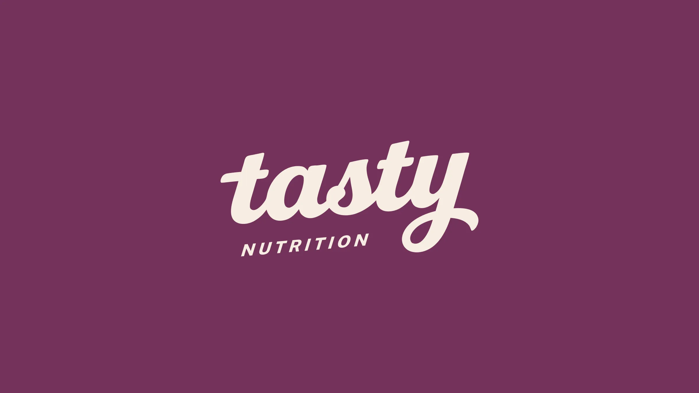
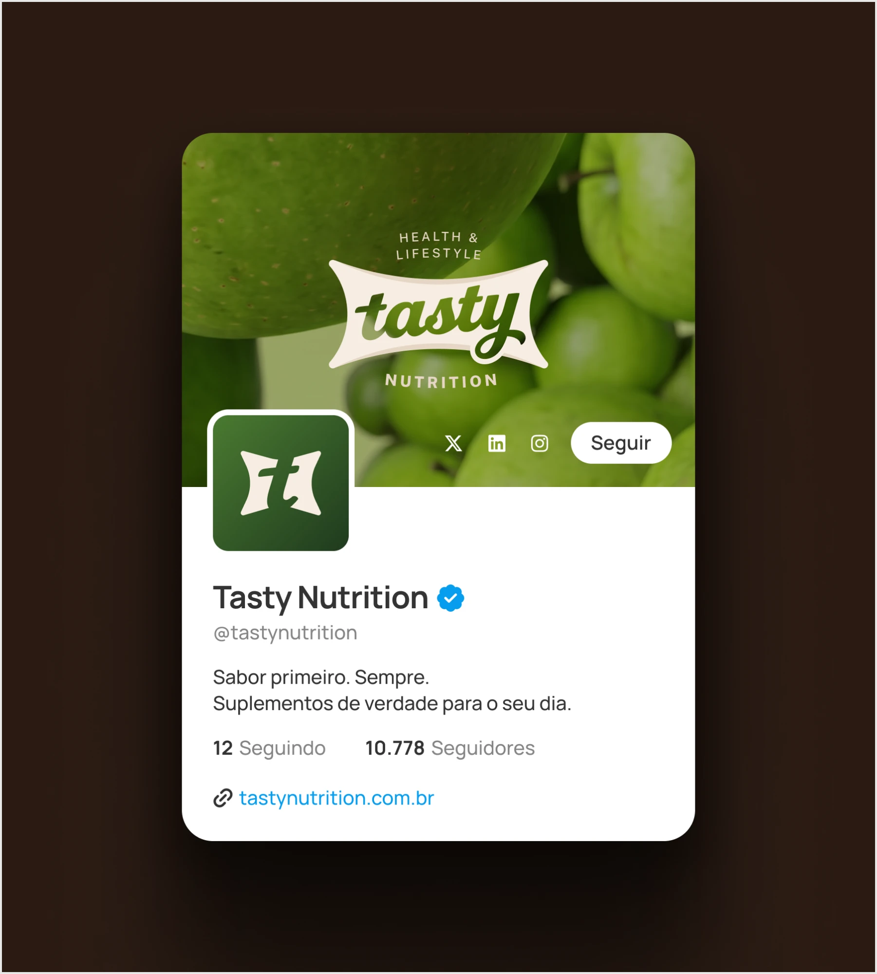
Visual identity for Tasty Nutrition, a premium supplements brand rooted in health, well-being and lifestyle. Instead of the category’s aggressive look, a script lettering inside a soft container, a palette that comes from the pantry and a voice that invites rather than demands.
It was all in the name.
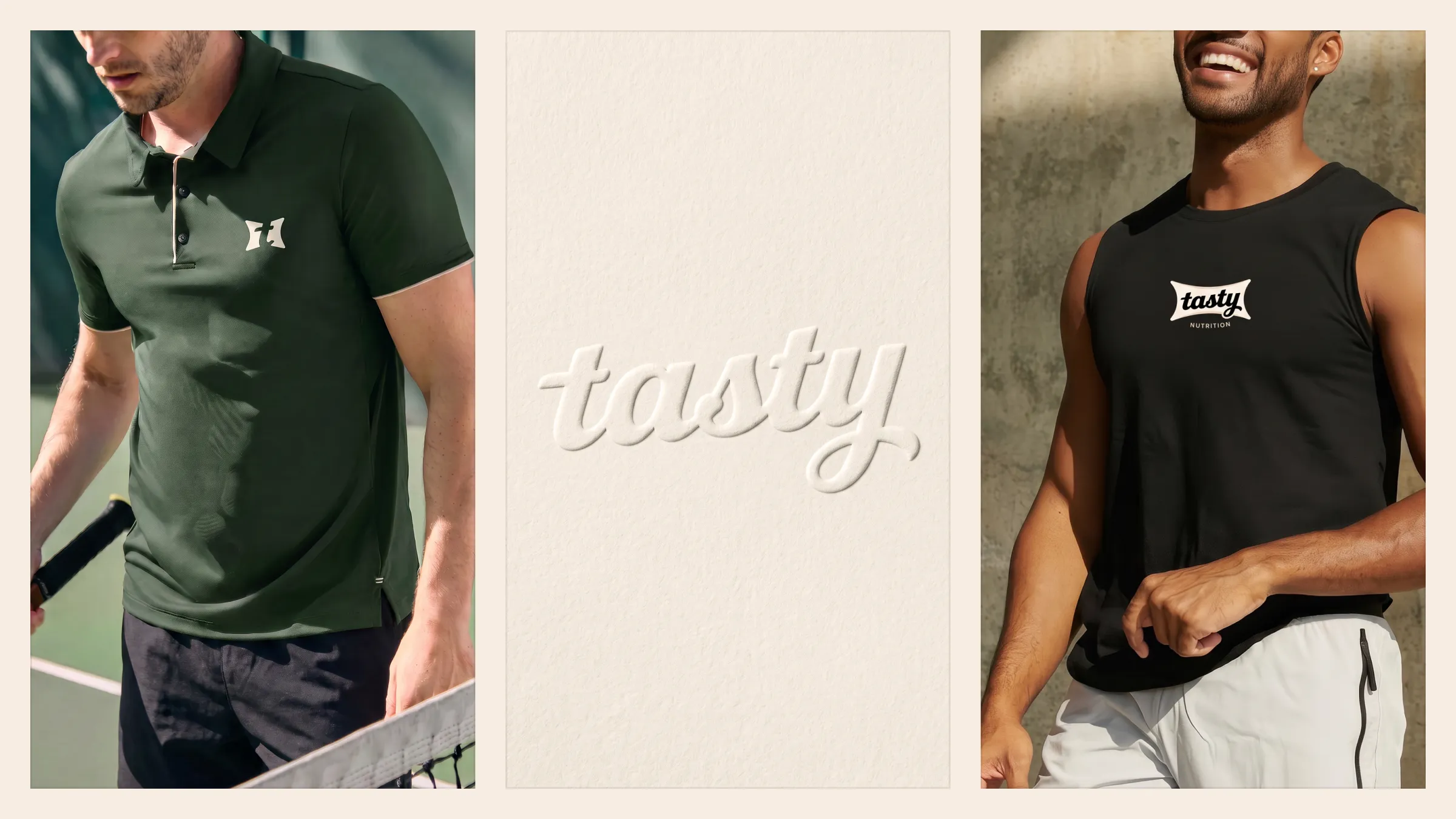
Tasty is not a word about performance, strength or pushing limits. It is a word about pleasure. The goal was a brand you could feel in your hand: with volume, weight and the softness of a surface that gives when pressed. Less like a symbol and more like food.
A premium supplements brand, rooted in health, well-being and lifestyle. Performance is there, but it does not drive the language. The core audience is adults over 35 with busy routines, people who have already tried things they could not keep up: for them, taste and convenience matter as much as the formula.
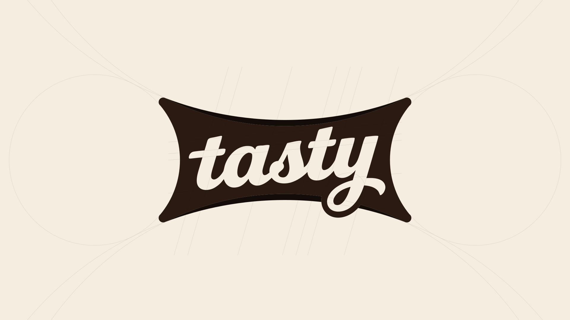
The container comes from the intersection of circles and ellipses. Its concave sides and flared tips create a shape under tension, full in the center and squeezed at the edges, as if pressed from the outside in. The lettering came next, drawn on a grid of slanted lines, with a continuous gesture and soft terminals.


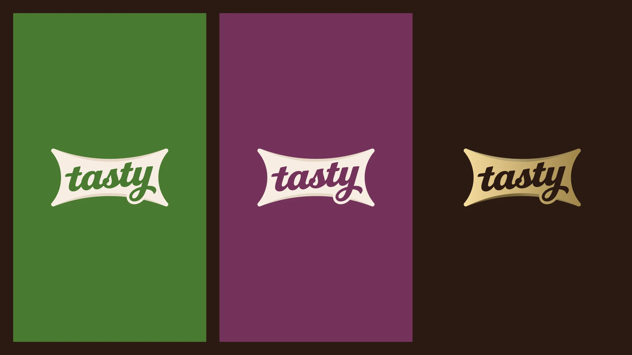
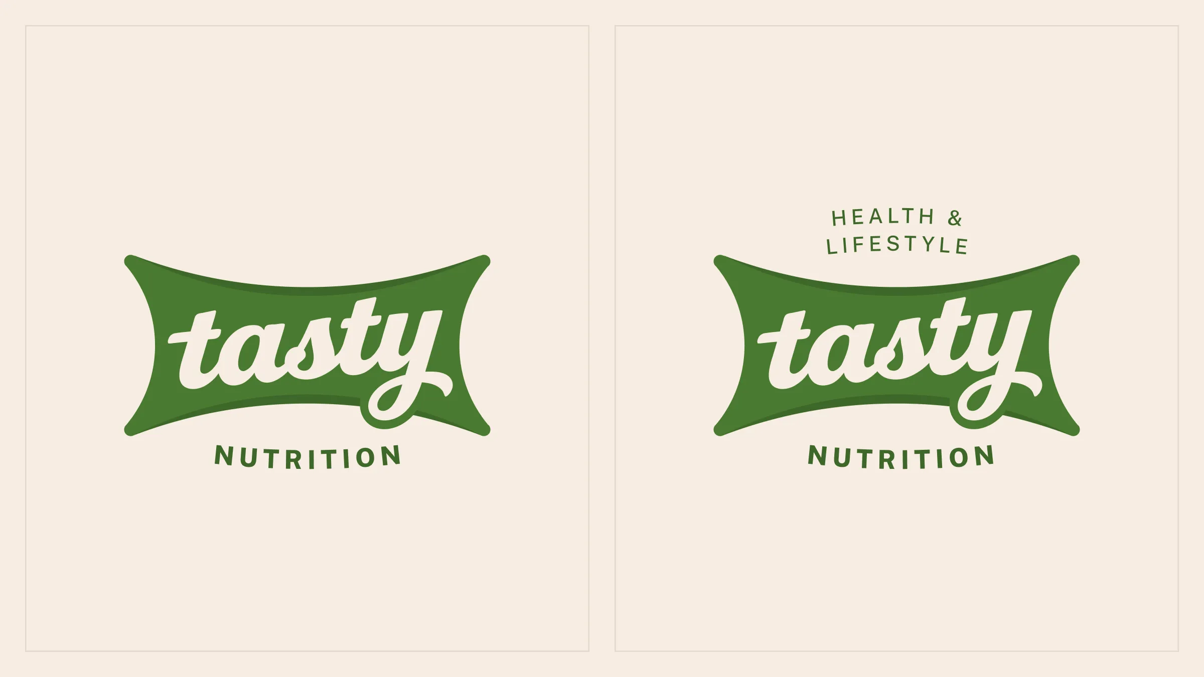
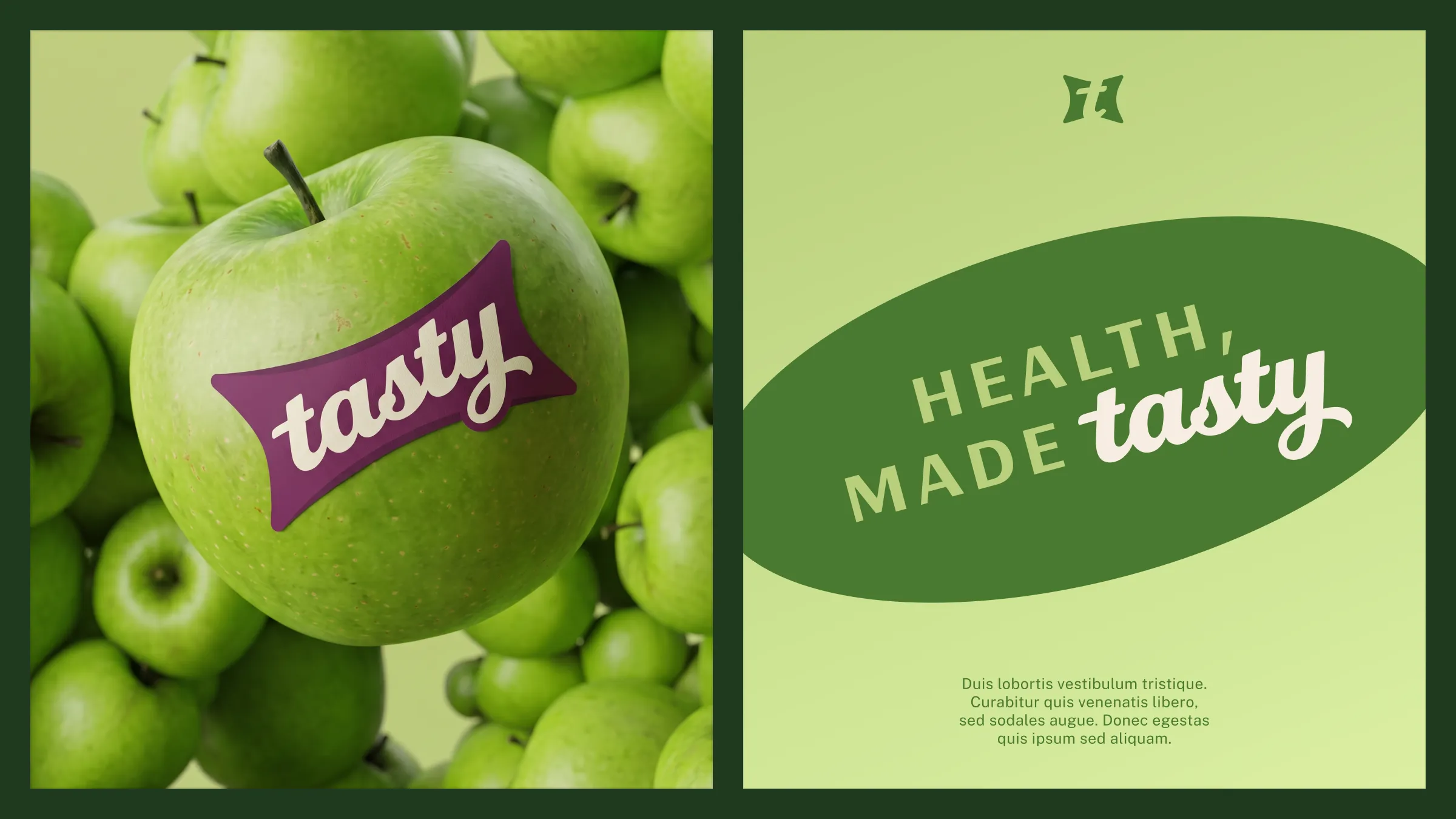
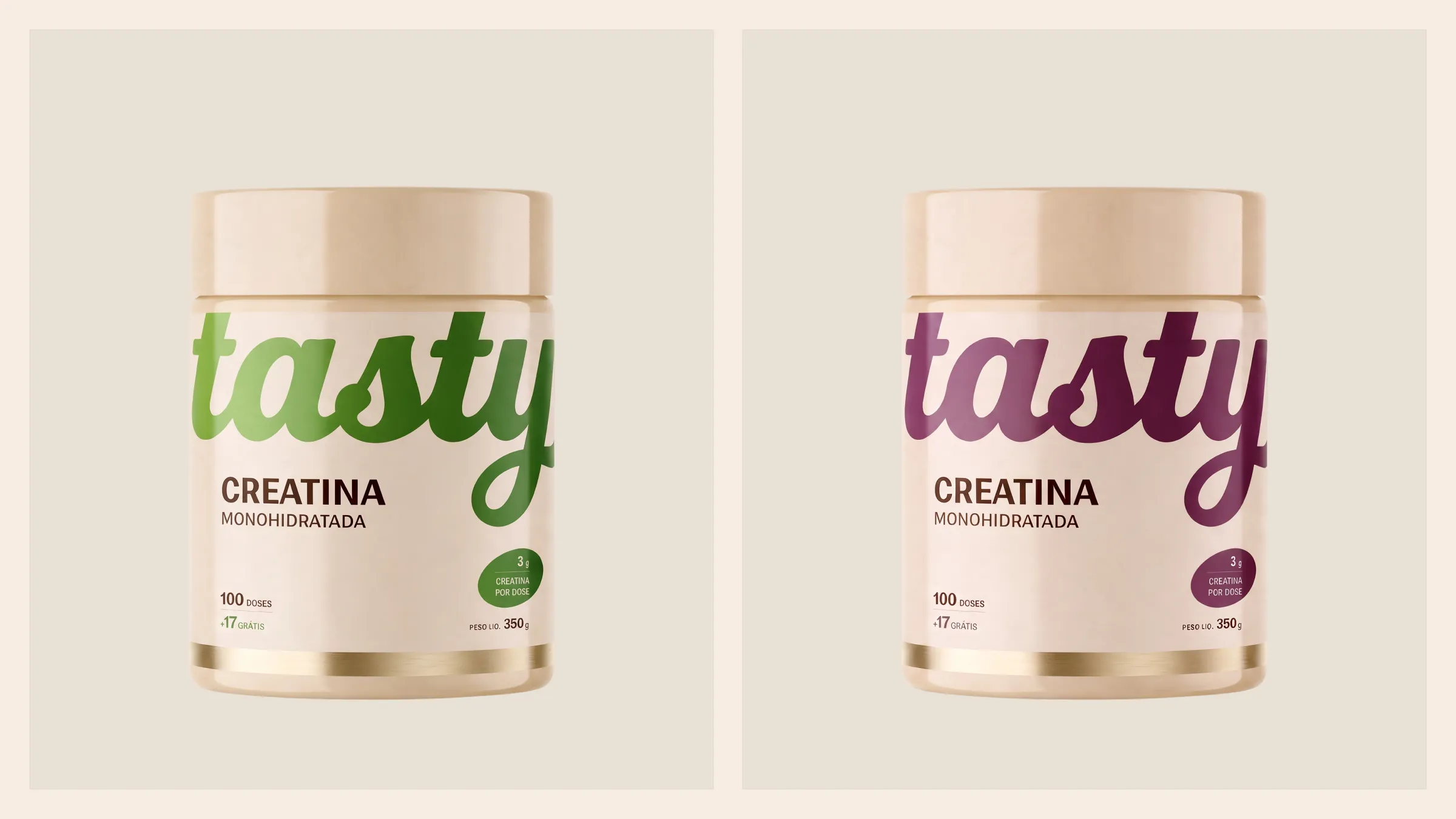
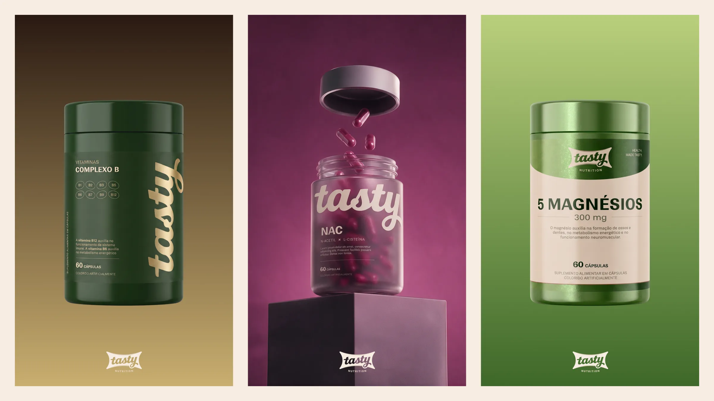
The palette comes from the pantry, not the lab. Mint, pistachio and avocado anchor the brand in warm greens, far from the clinical pharmacy green, on a vanilla base. Plum, hazelnut, chocolate and cocoa translate what is inside the tub, and gold leaf, in fine lines and details, carries the premium feel.
- Mint#4A7A31
- Pistachio#B9CF7C
- Avocado#1F3A1E
- Plum#73325A
- Vanilla#F6EDE1
- Hazelnut#C29A74
- Chocolate#5E3823
- Cocoa#2A1A12
- Gold leaf#C9AE70
A good supplement is the one you take every day.
Ranade for headlines and highlights: geometric, with clean terminals, it balances the hand-drawn lettering with a rational structure. Instrument Sans for text and information, from captions to the nutrition table. The lettering never becomes a typeface: it is a signature.
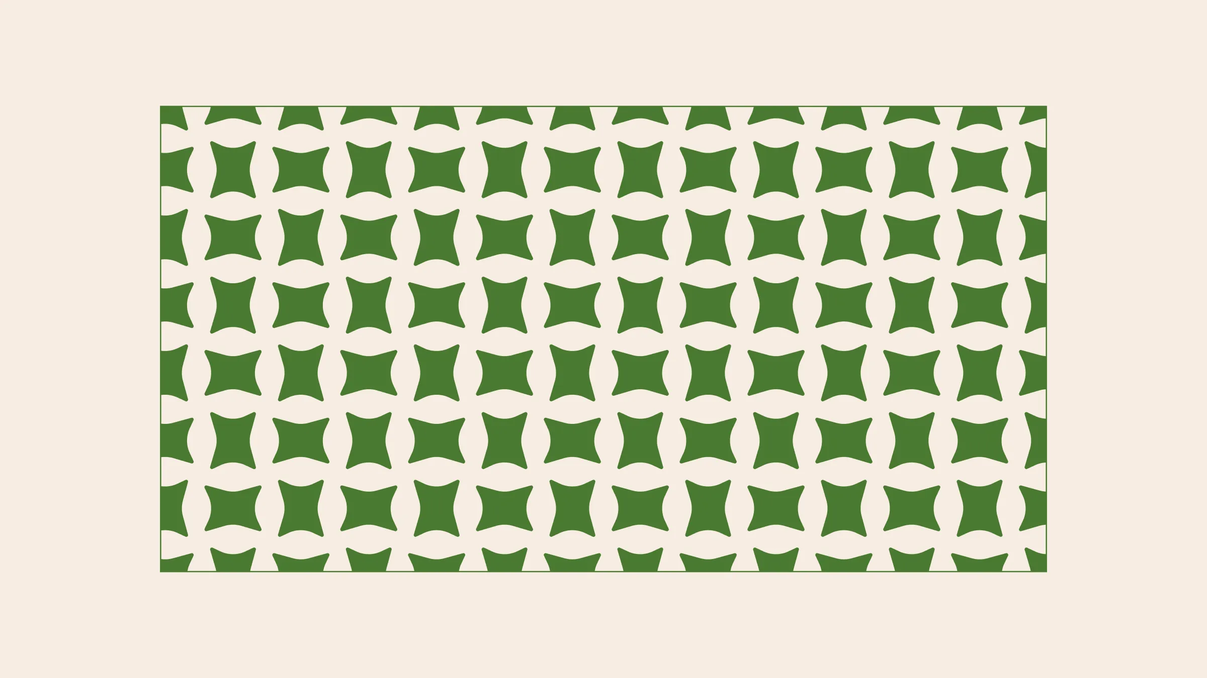
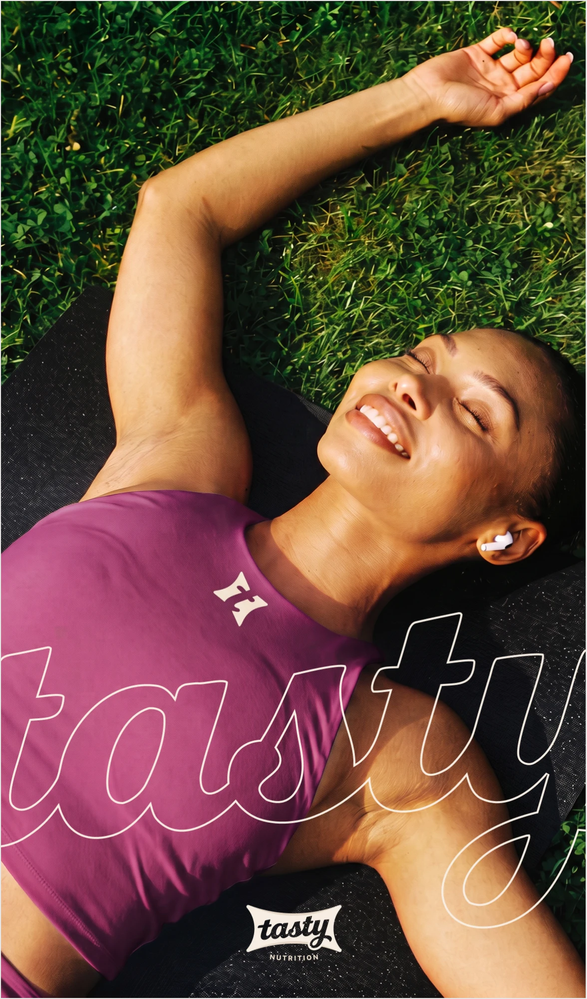
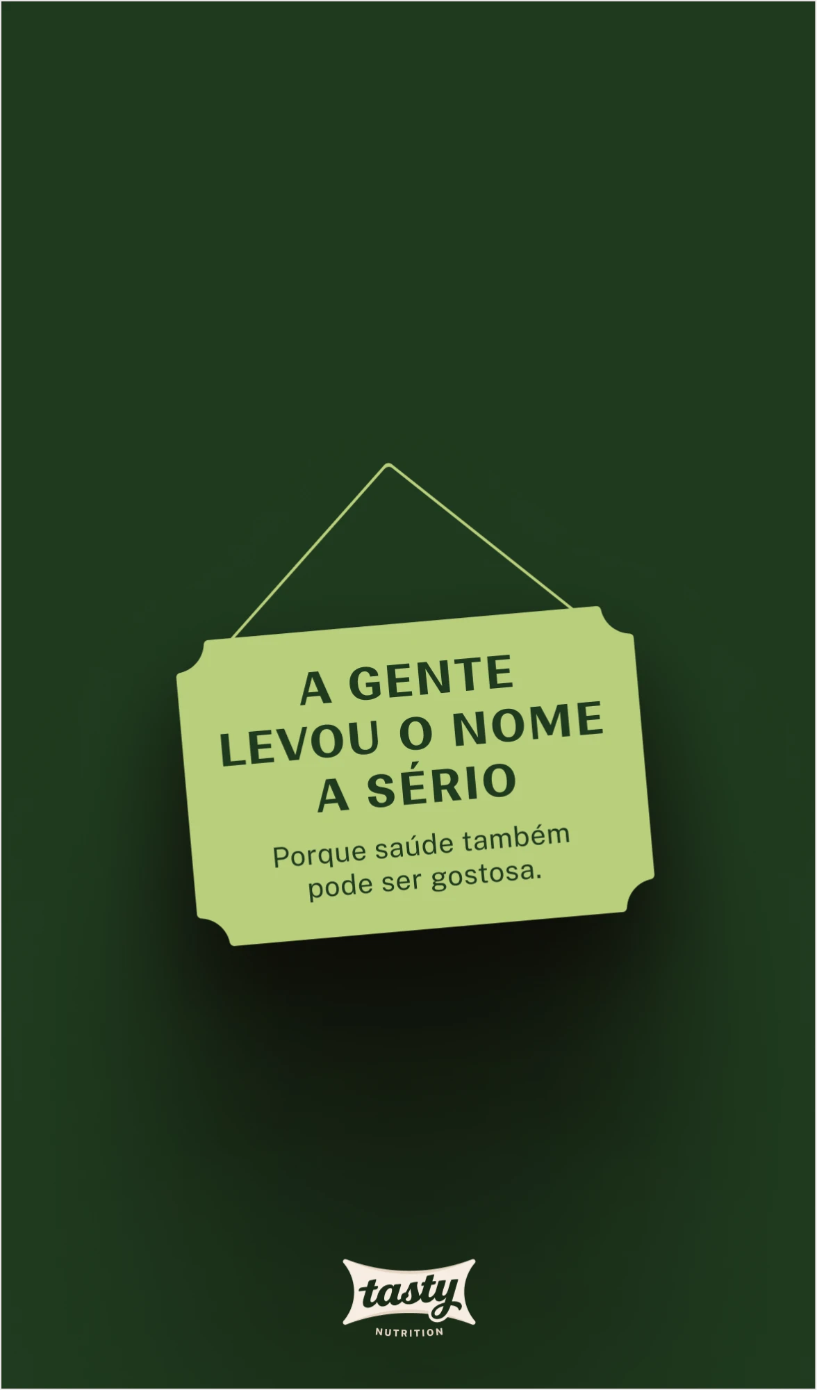
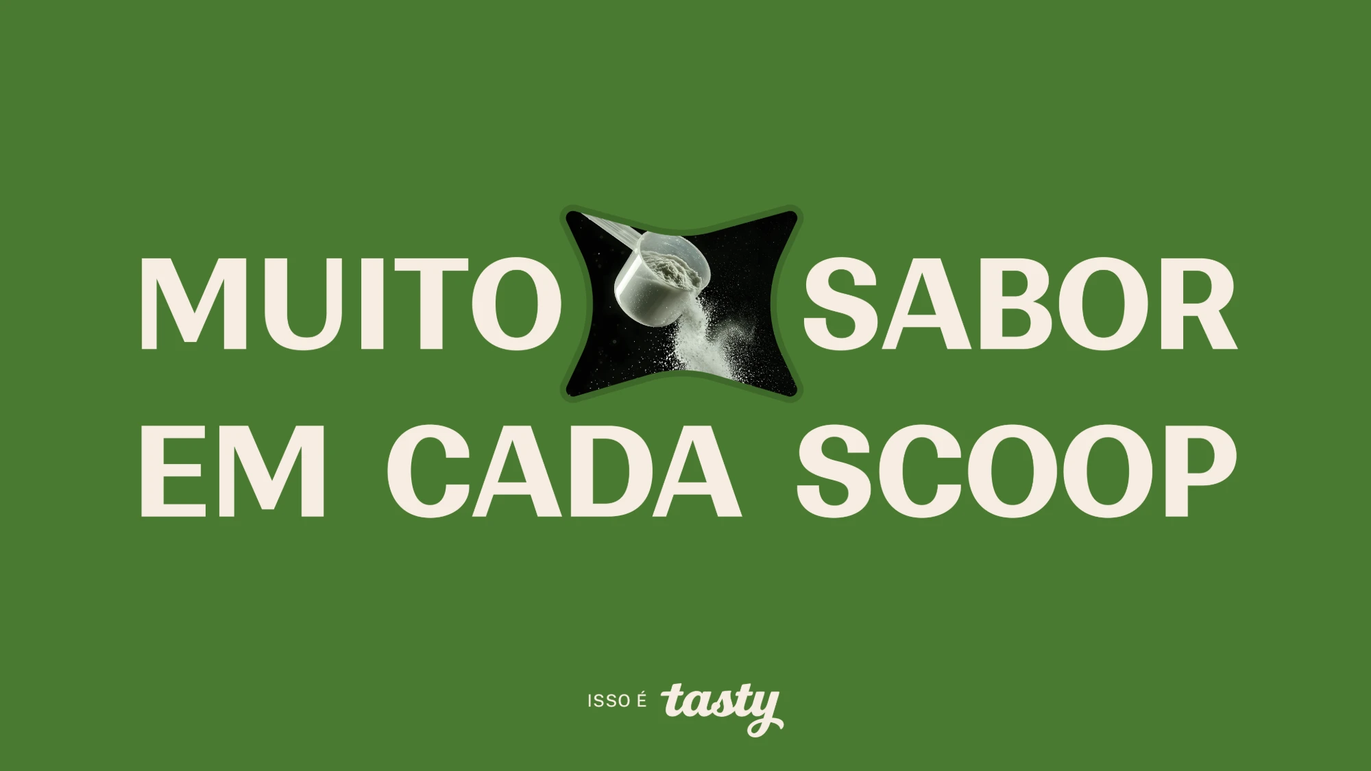
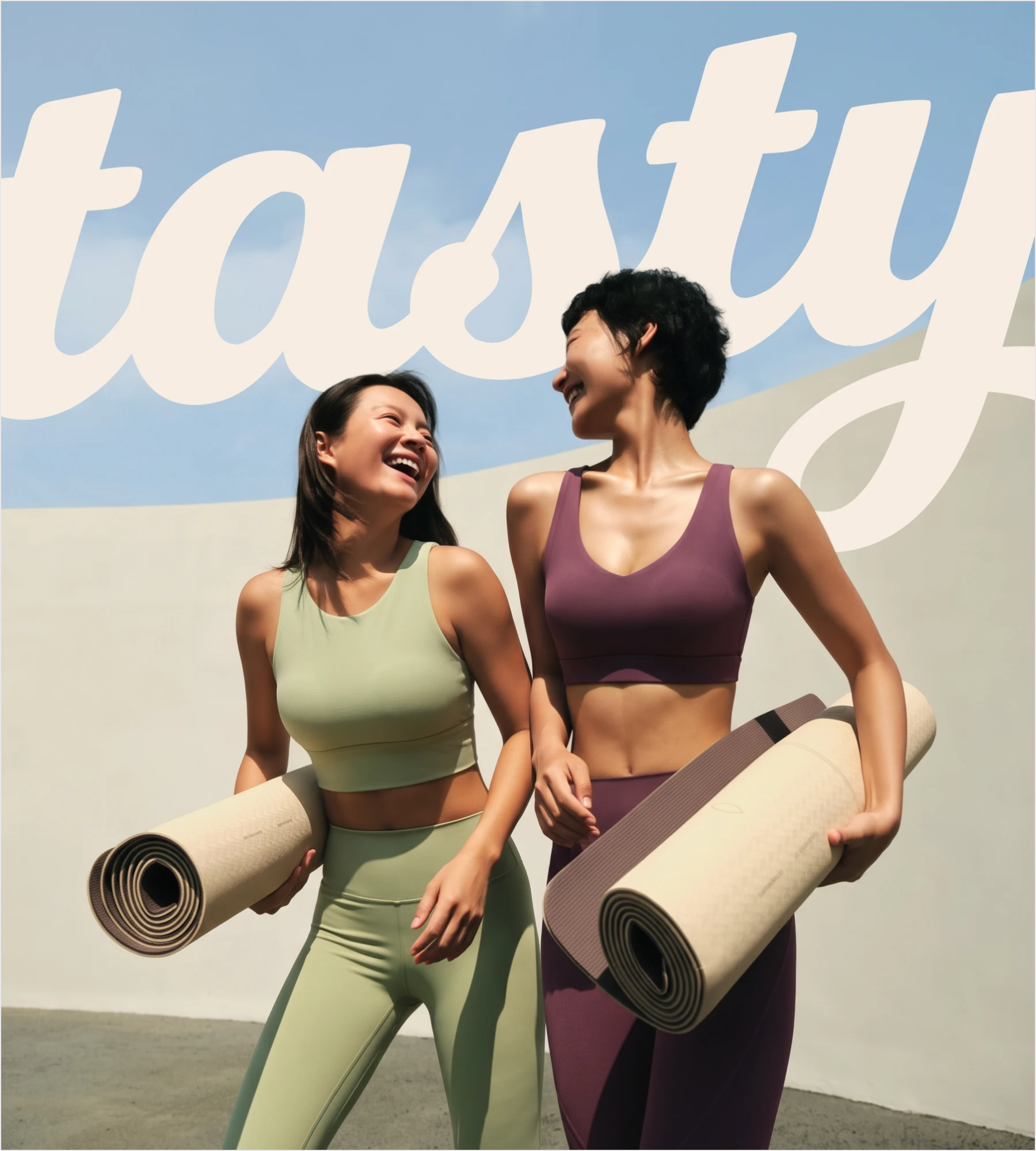
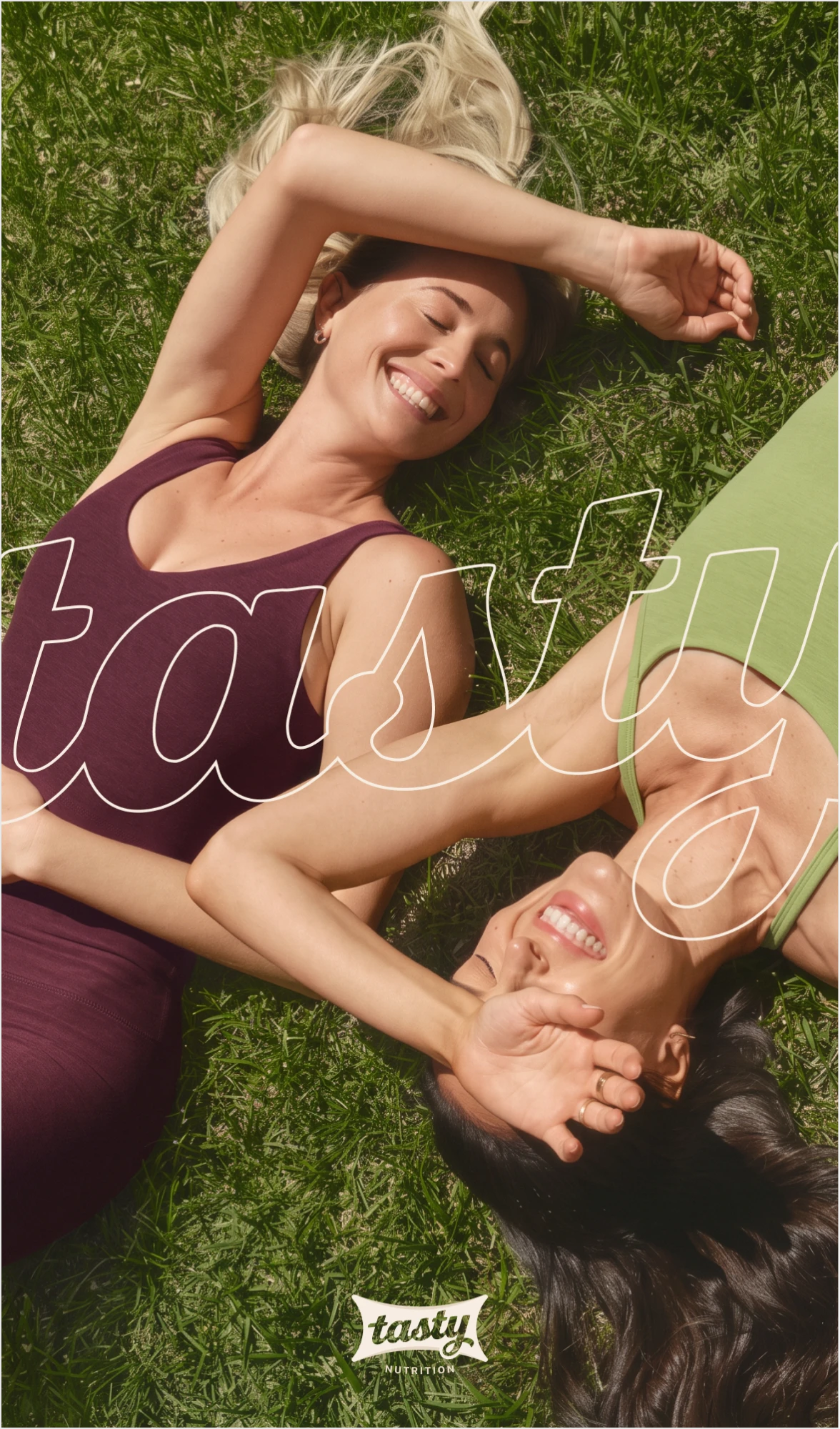
The shape that holds the lettering also stands on its own, as a frame, a tag or a crop. Repeated in a grid, it becomes the brand pattern. The script can also bleed off the edge: since the letters are unique, Tasty stays recognizable even when half of it is cut off.
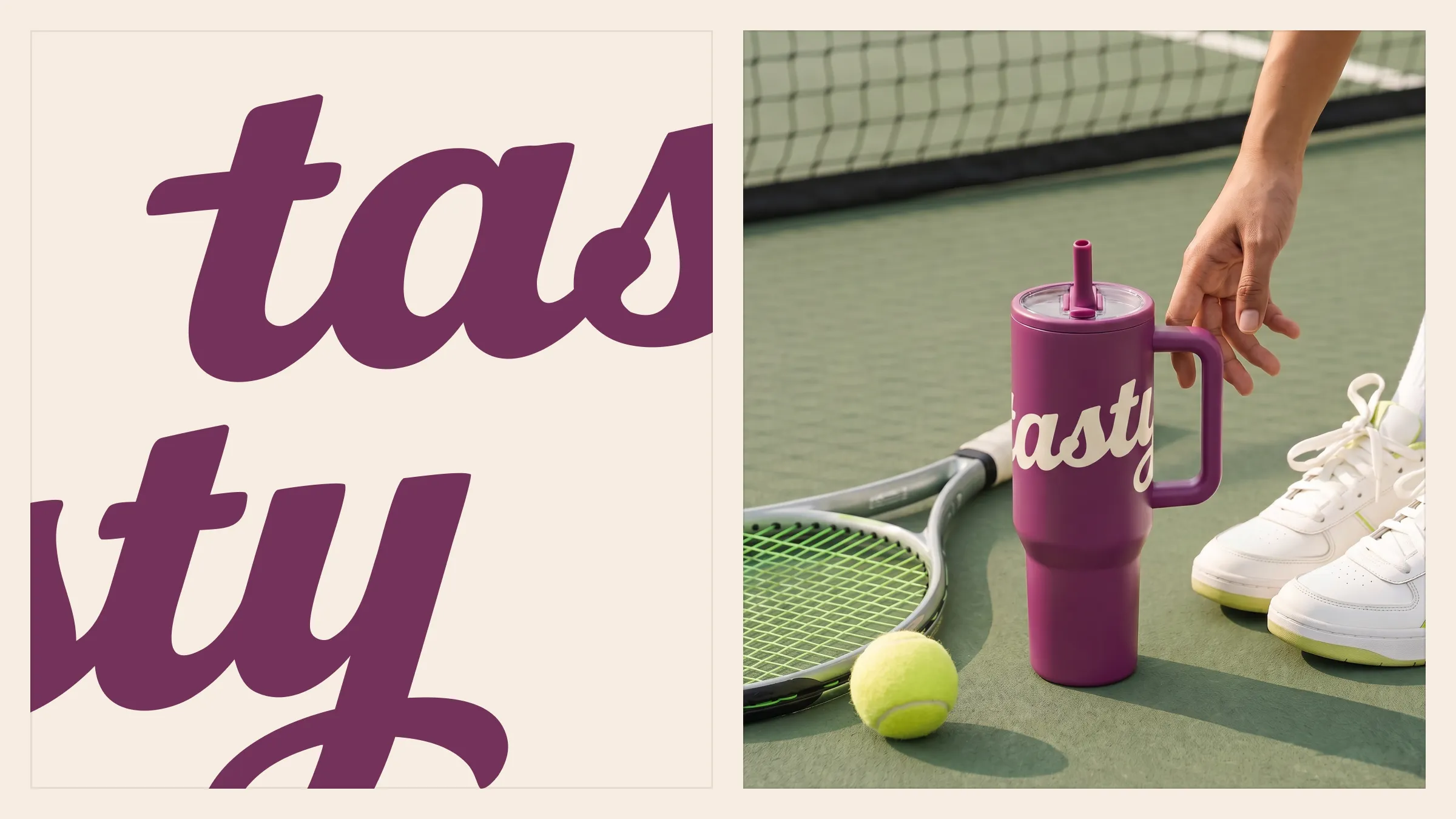
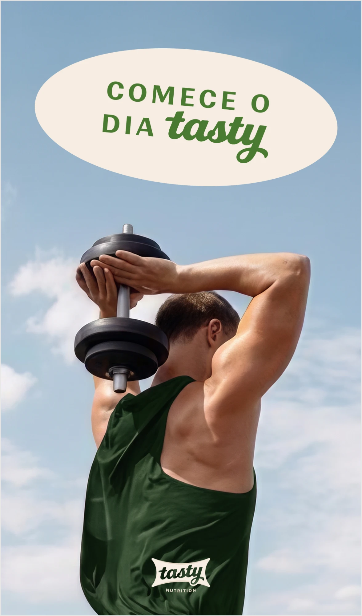
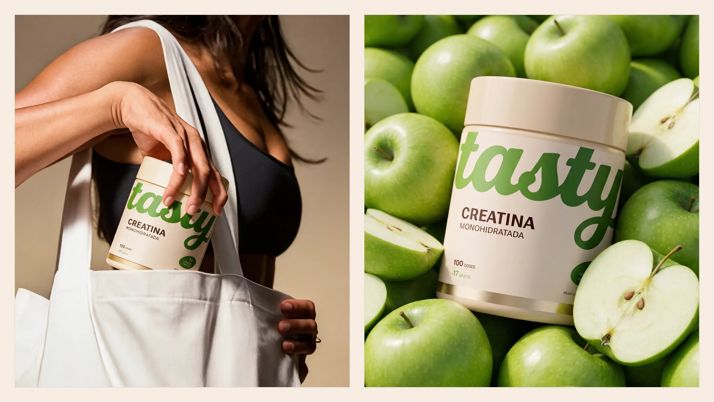
Real people, in real movement, in everyday situations. Faces that show pleasure and rest, not strain. Natural light, sky, soft shadows and food nearby; no gym interiors, power poses or dark backgrounds.
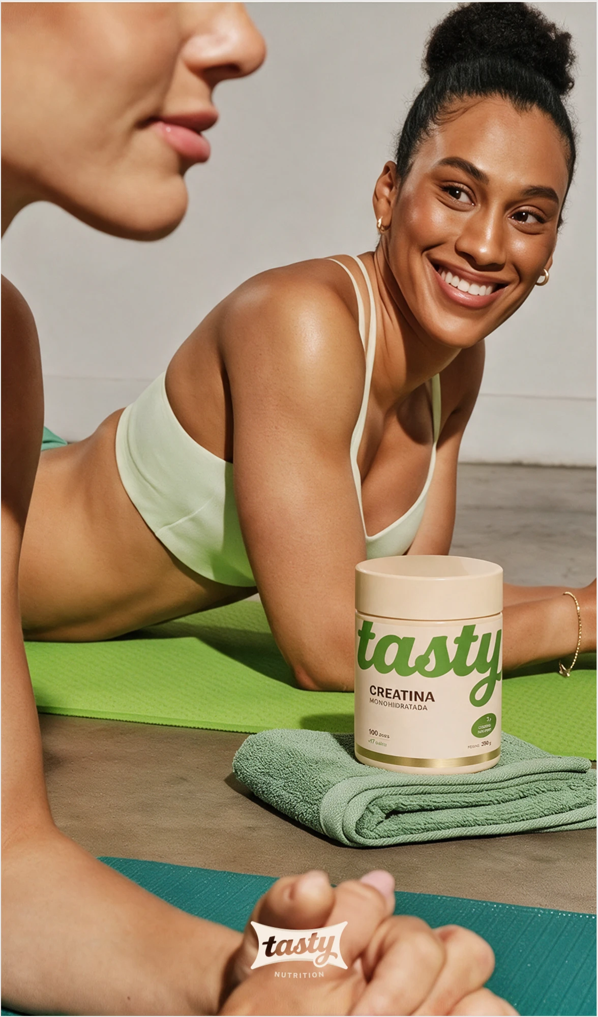




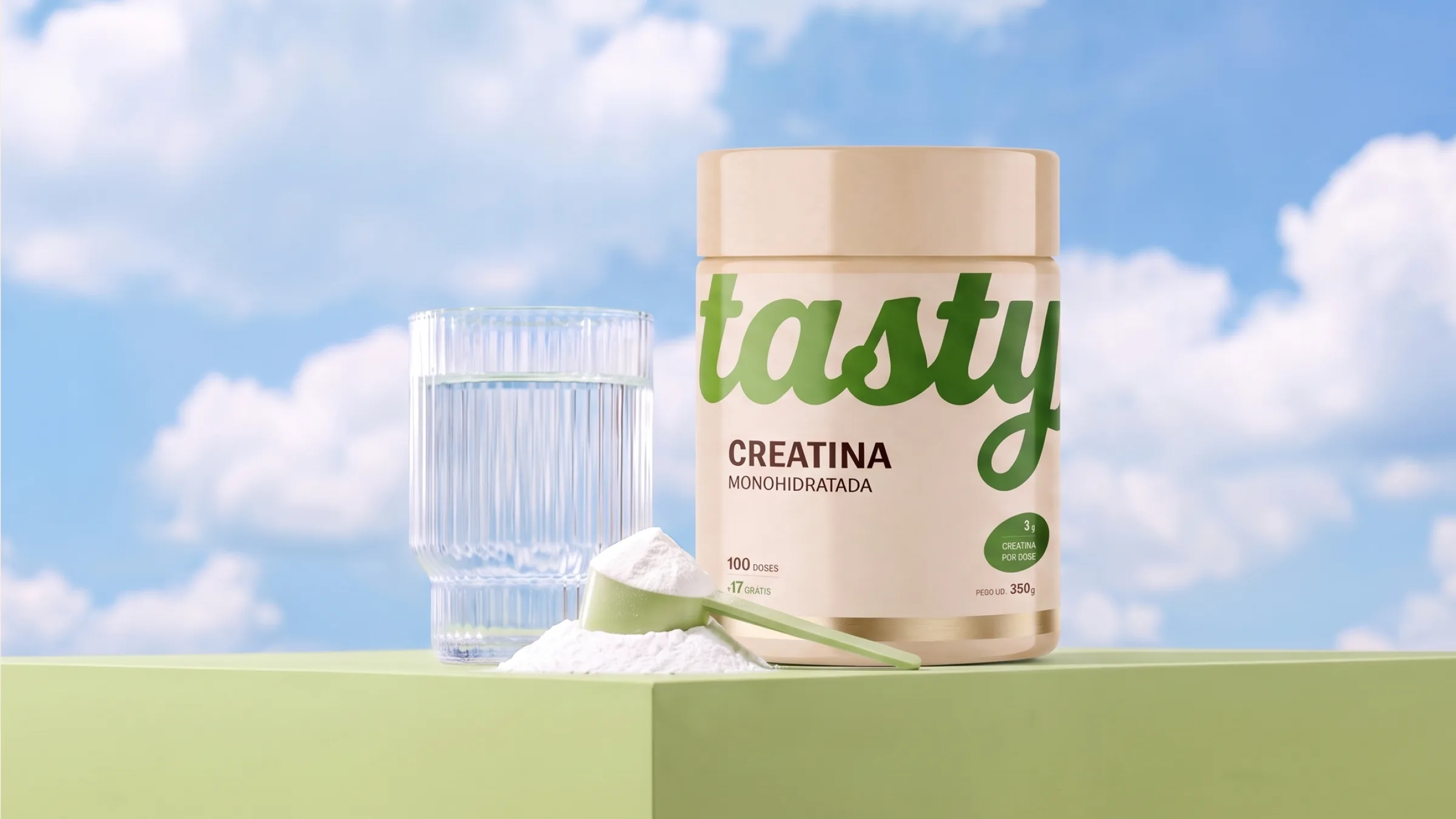
On the tub, the lettering spans the front edge to edge and is cut off by the curve, just as the guidelines allow. The color changes with each line, from mint to plum, without breaking the system, and the gold sits in the finishing line.
A good brand is one you recognize without reading it.
- Design
- Nícolas de Queiróz
- Intermediation
- SD Digital