Frias Constantino
Preventive and strategic tax law.
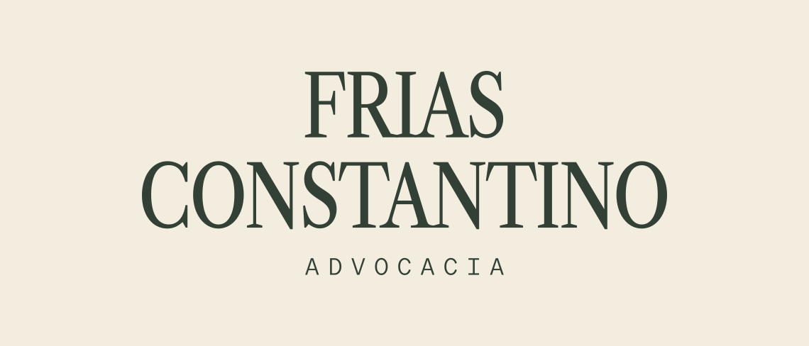
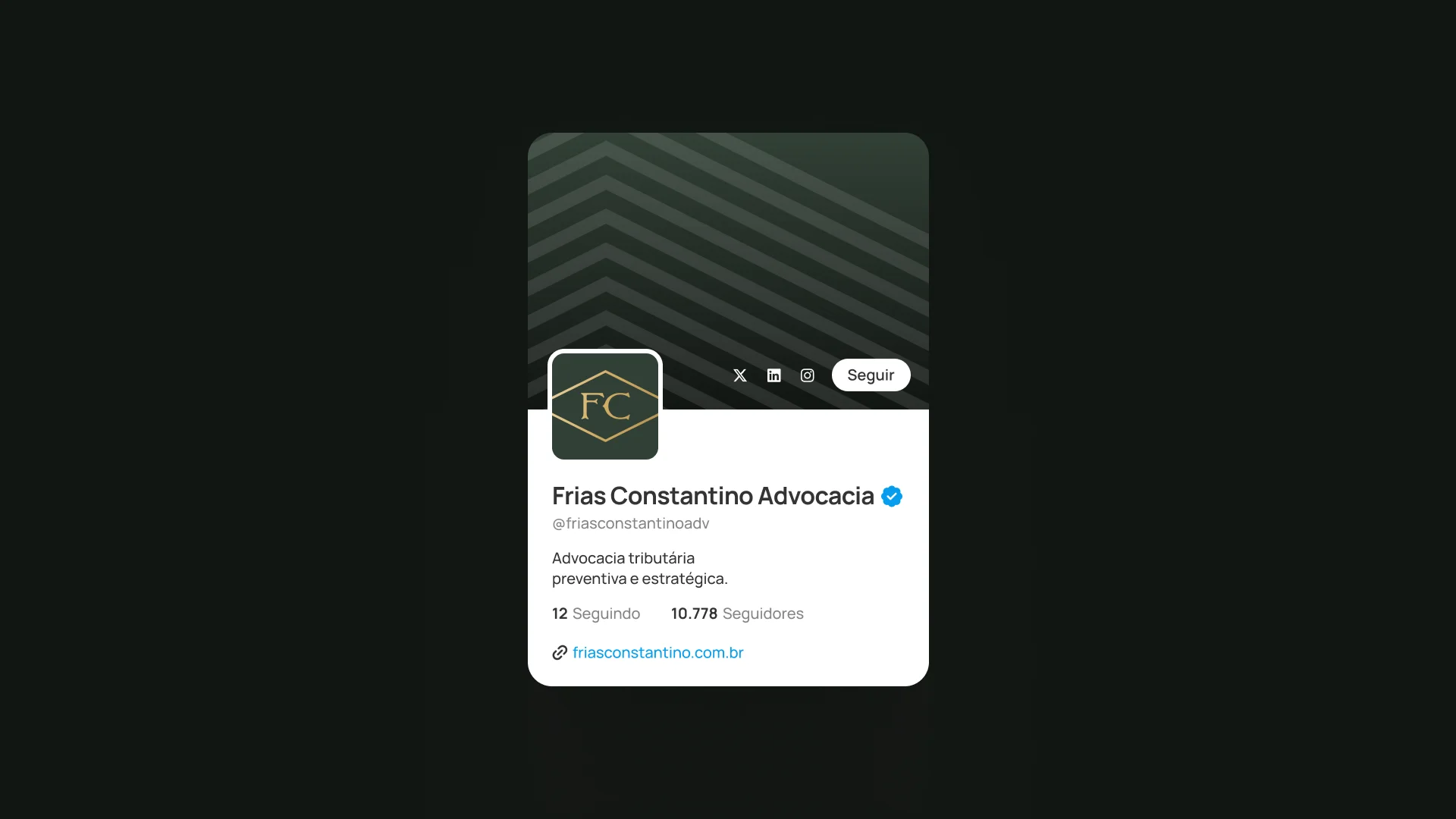
Visual identity for Frias Constantino Advocacia, a tax law firm in Tatuapé, São Paulo. An owl in an engraving line, an FC monogram of overlapping initials and a palette of green, sand and gold communicate precision before the very first conversation.
A brand built with the same rigor it stands for.
Every choice, from the line to the typography, answers to an intention: to communicate precision before the very first conversation.
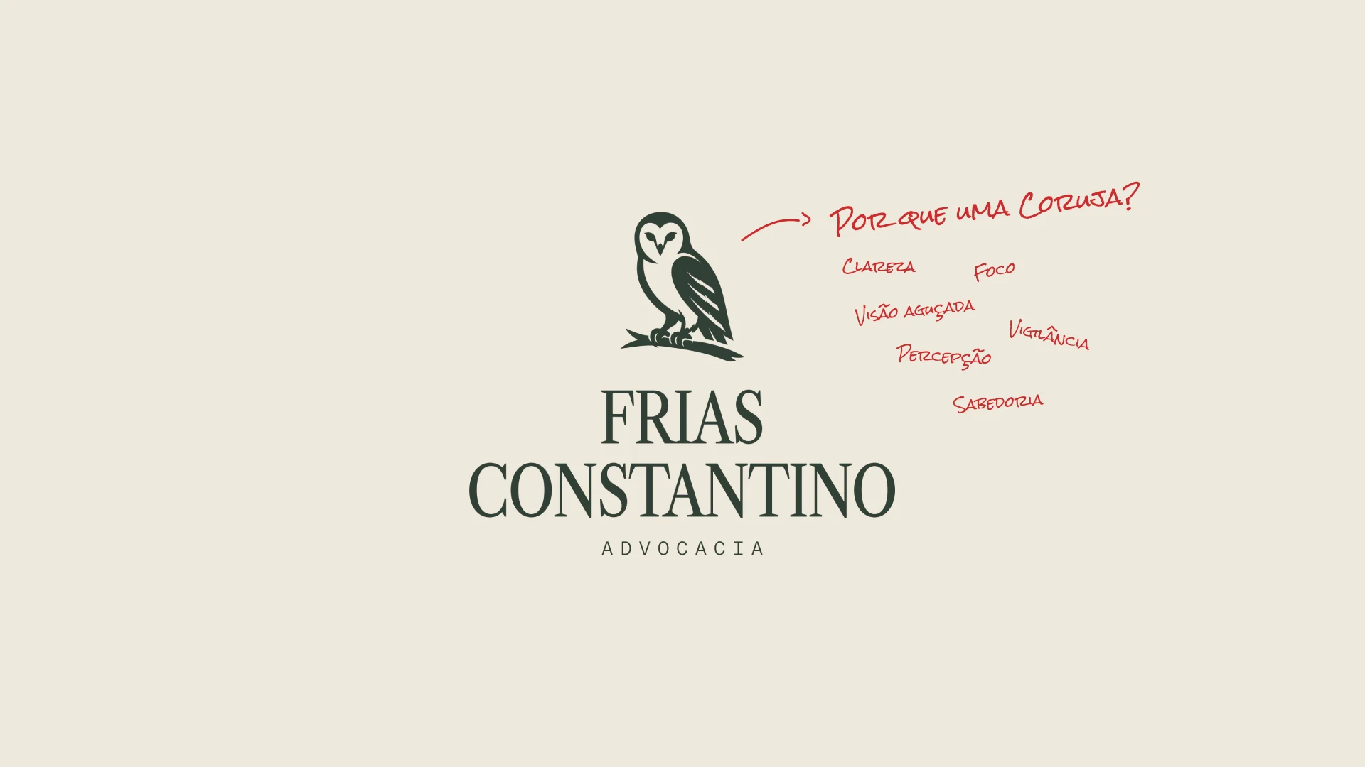
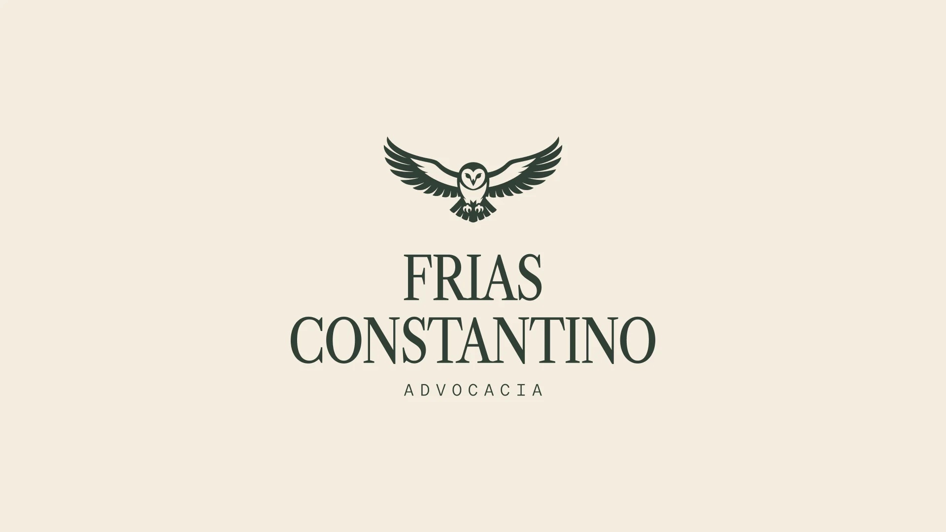
The owl crosses cultures as a symbol of wisdom. It is the companion of Athena, the Greek goddess of strategy. But what makes it right for this brand is its behavior: it sees where others do not, flies in absolute silence and acts with surgical precision. Observation, discretion and precision: the same triad that defines good tax law. Drawn in an engraving line, it recalls the legal and editorial tradition; in flight, it conveys a practice that does not wait for the problem: it anticipates.
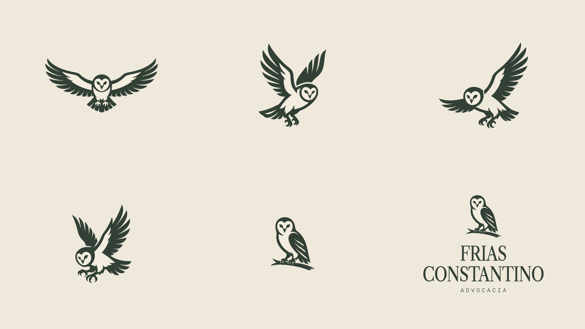
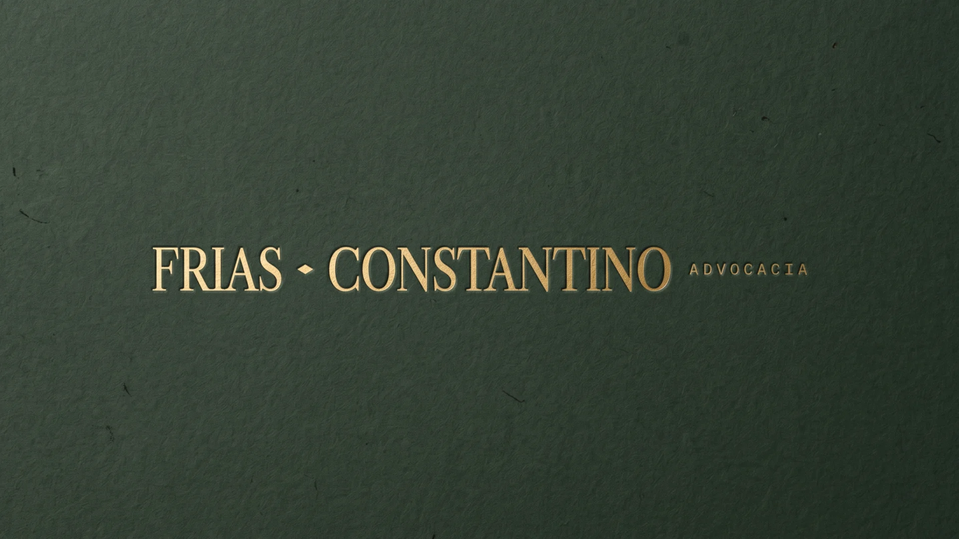
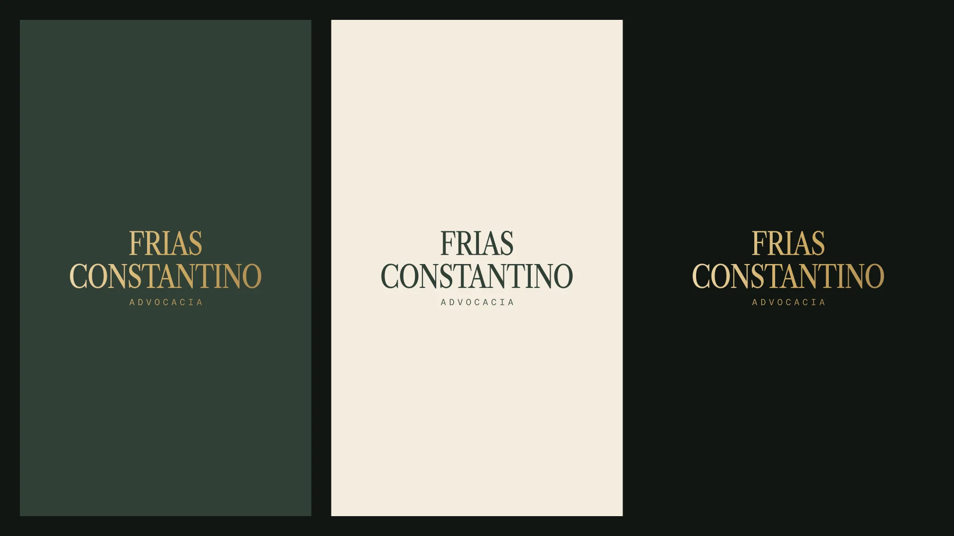
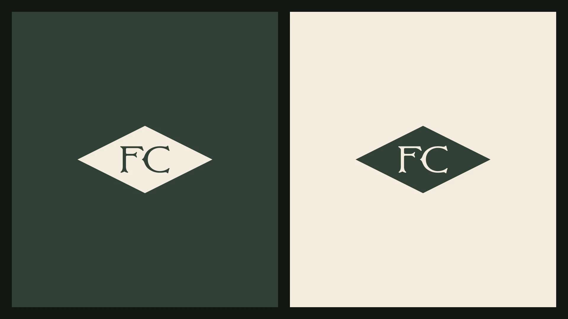
The two-line name is the main signature and adapts to each background: gold on green or black, green on sand. When there is room, the flying owl or the diamond FC seal joins the name to form the full signatures.
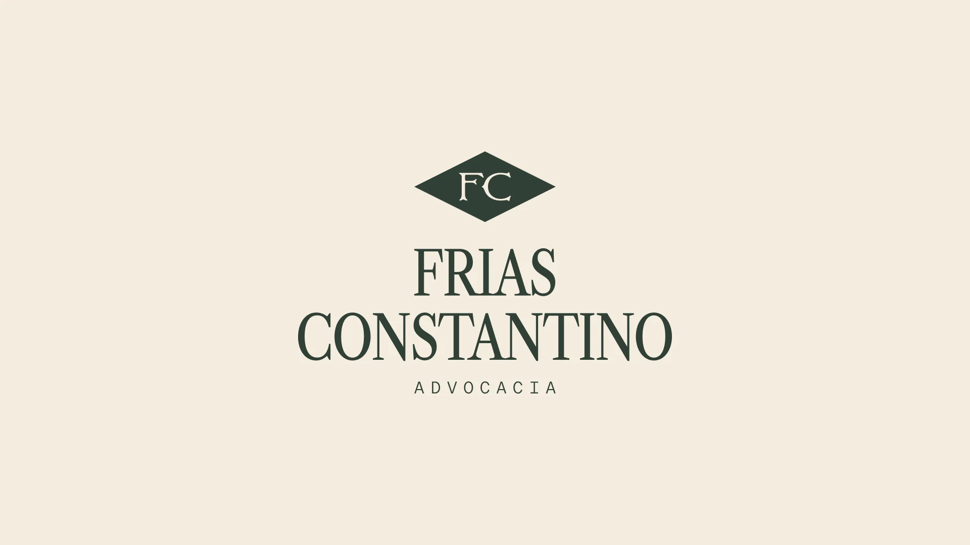
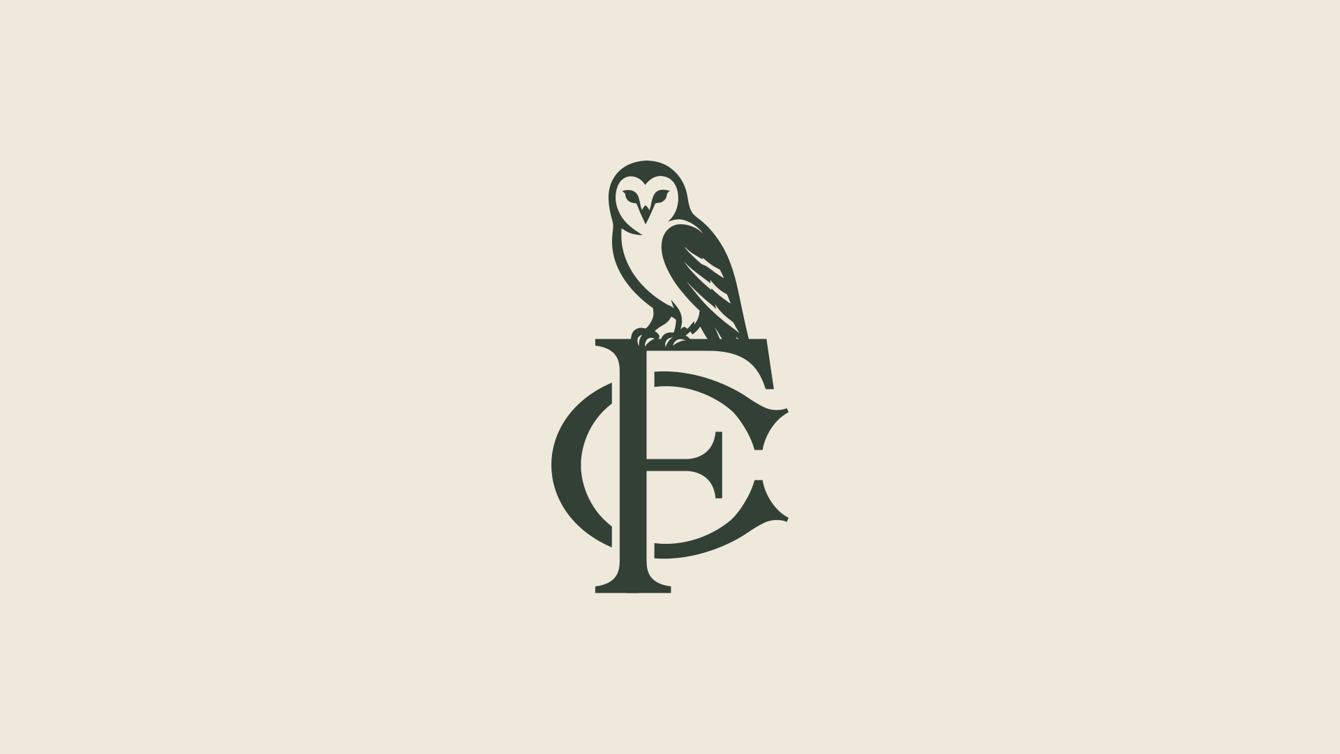
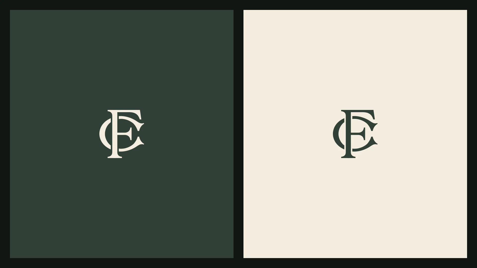
The FC monogram is born from the overlap of the initials, not side by side, but crossed. The F rests on the structure of the C, and the C embraces the stem of the F. It is a construction that only works because the two shapes were drawn for each other, just as a good argument only holds when each point ties into the next. The design comes from the tradition of seal monograms: the stamp that, long before digital signatures, validated documents and vouched for what was written. On its own, the monogram is the most condensed form of the brand: where the full name does not fit, it answers.


The palette starts from green, the color of stability, balance and prosperity, in a family that goes from deep to serene, holding the brand with the same constancy expected from good counsel. Over it, sand and browns bring the warmth of paper and leather, a repertoire inherited from the world of documents and legal libraries. Gold, always in a precise dose, is the point of value: it appears where the brand wants to lead the eye, like a thread of emphasis amid sobriety.
- Green#324036
- Light green#92A673
- Dark green#111512
- Sand#F3EDDF
- Light brown#AF9061
- Dark brown#2E2216
- Light gold#F1DEB5
- Gold#D0AC64
- Dark gold#97733D
No color shouts; all of them assert.
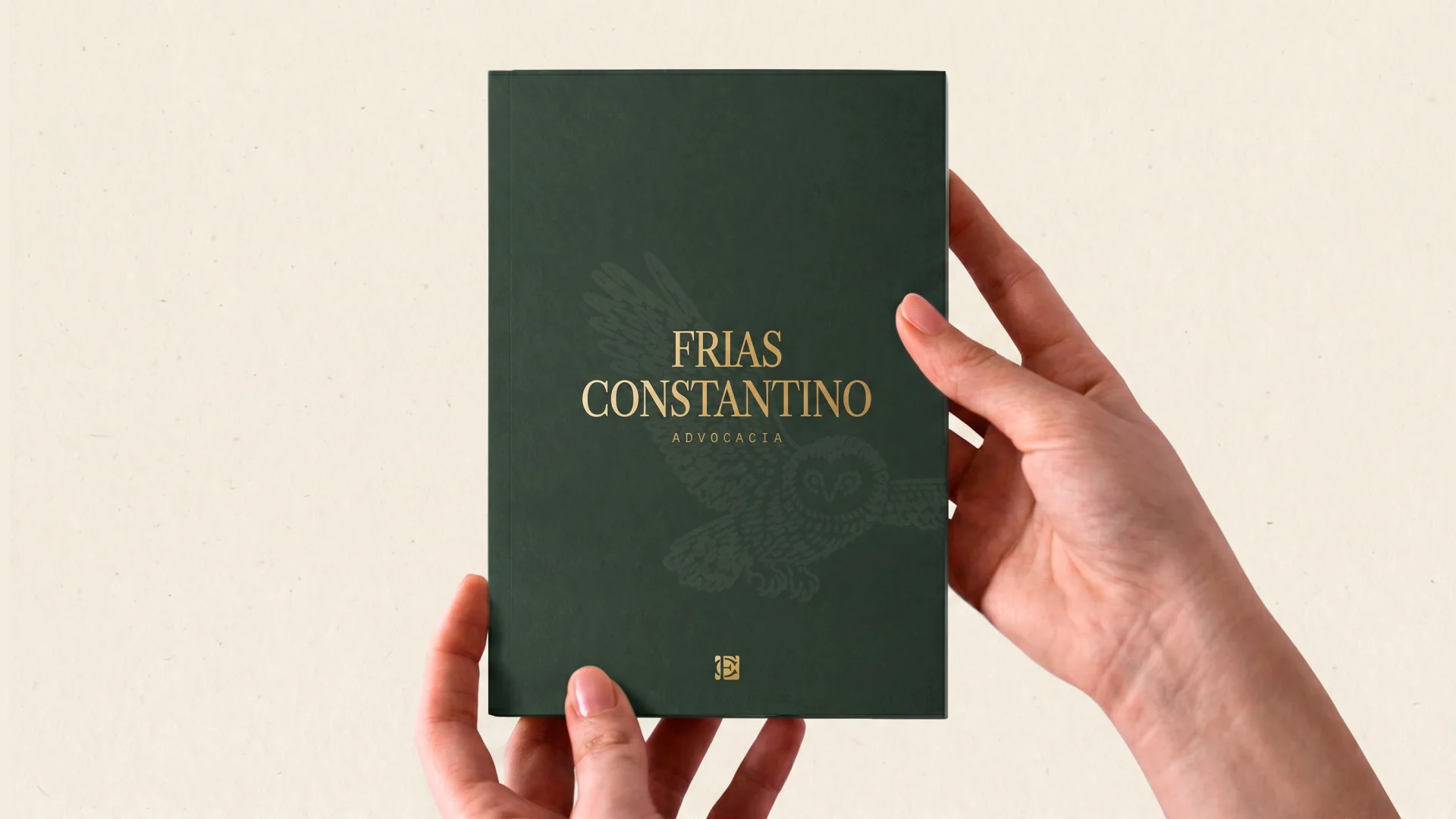
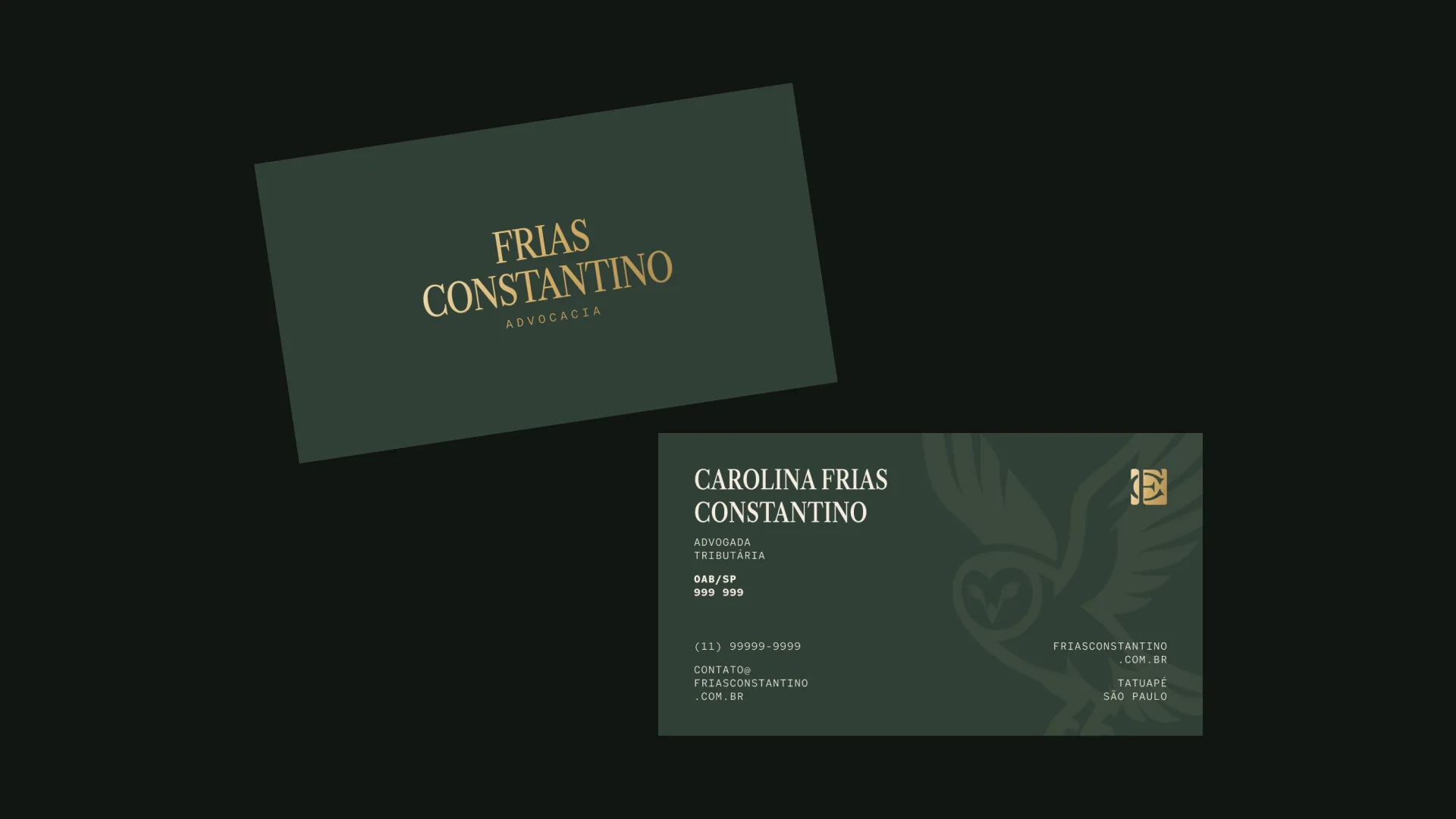
The identity takes shape on paper, fabric and screen: gold in relief over deep green, the owl as a watermark and the monogram as a signature, where the full name does not fit.
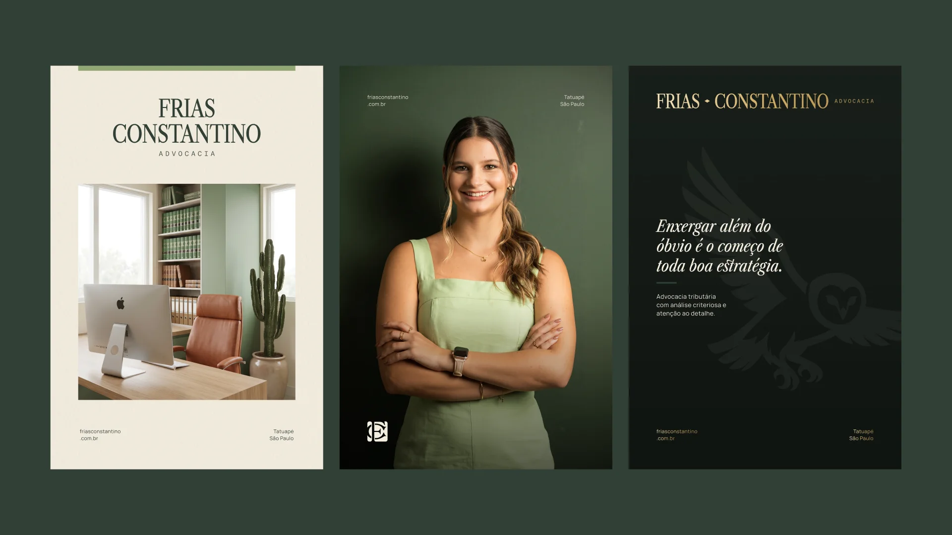
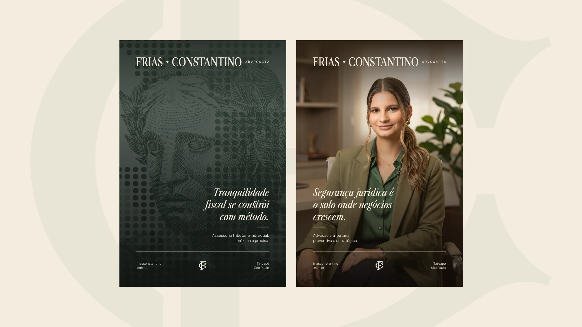
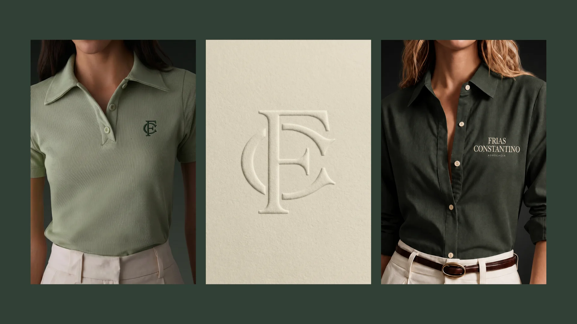
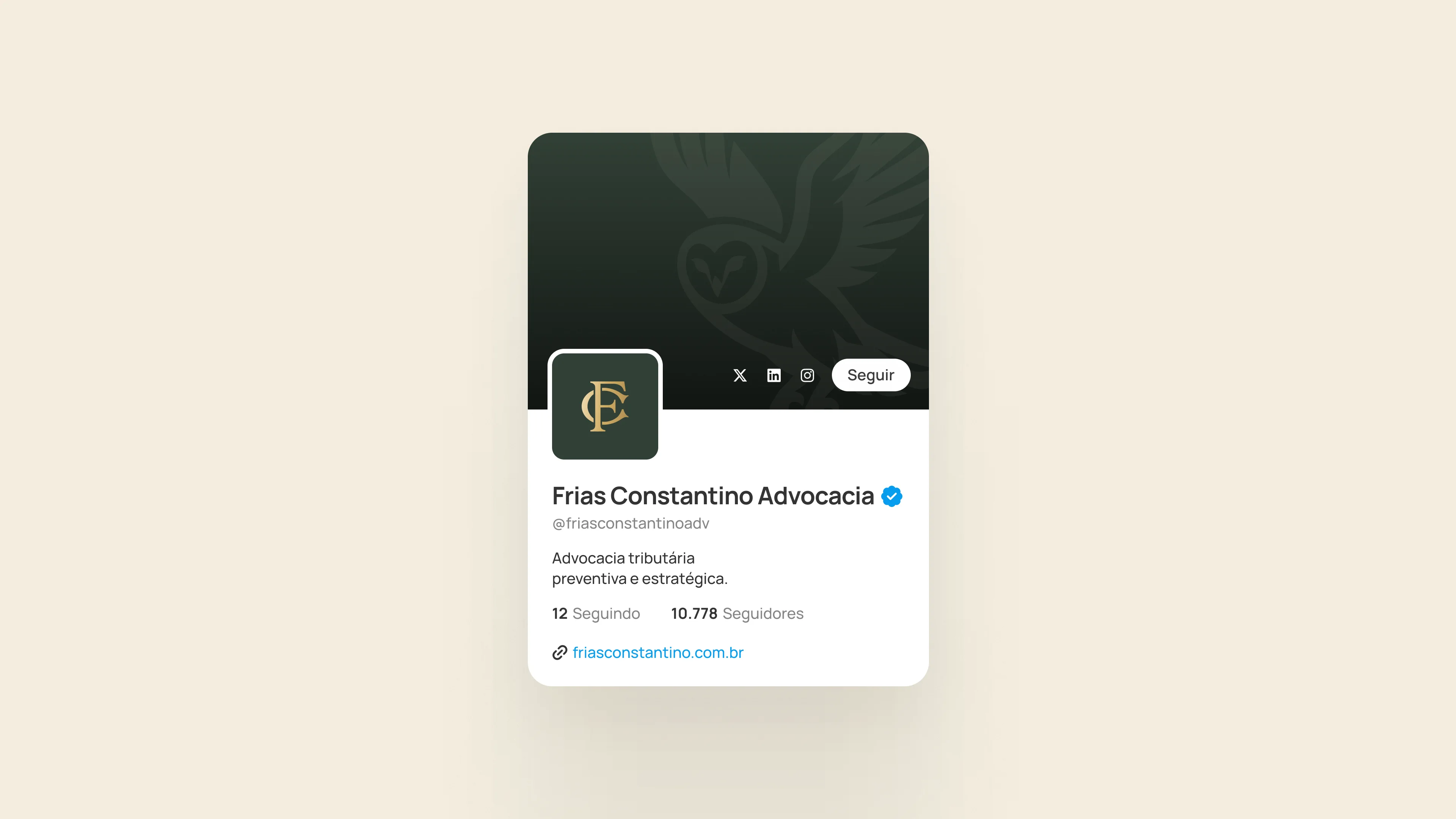
Precision before the first conversation.
- Design
- Nícolas de Queiróz
- Briefing
- Carolina Frias Constantino