
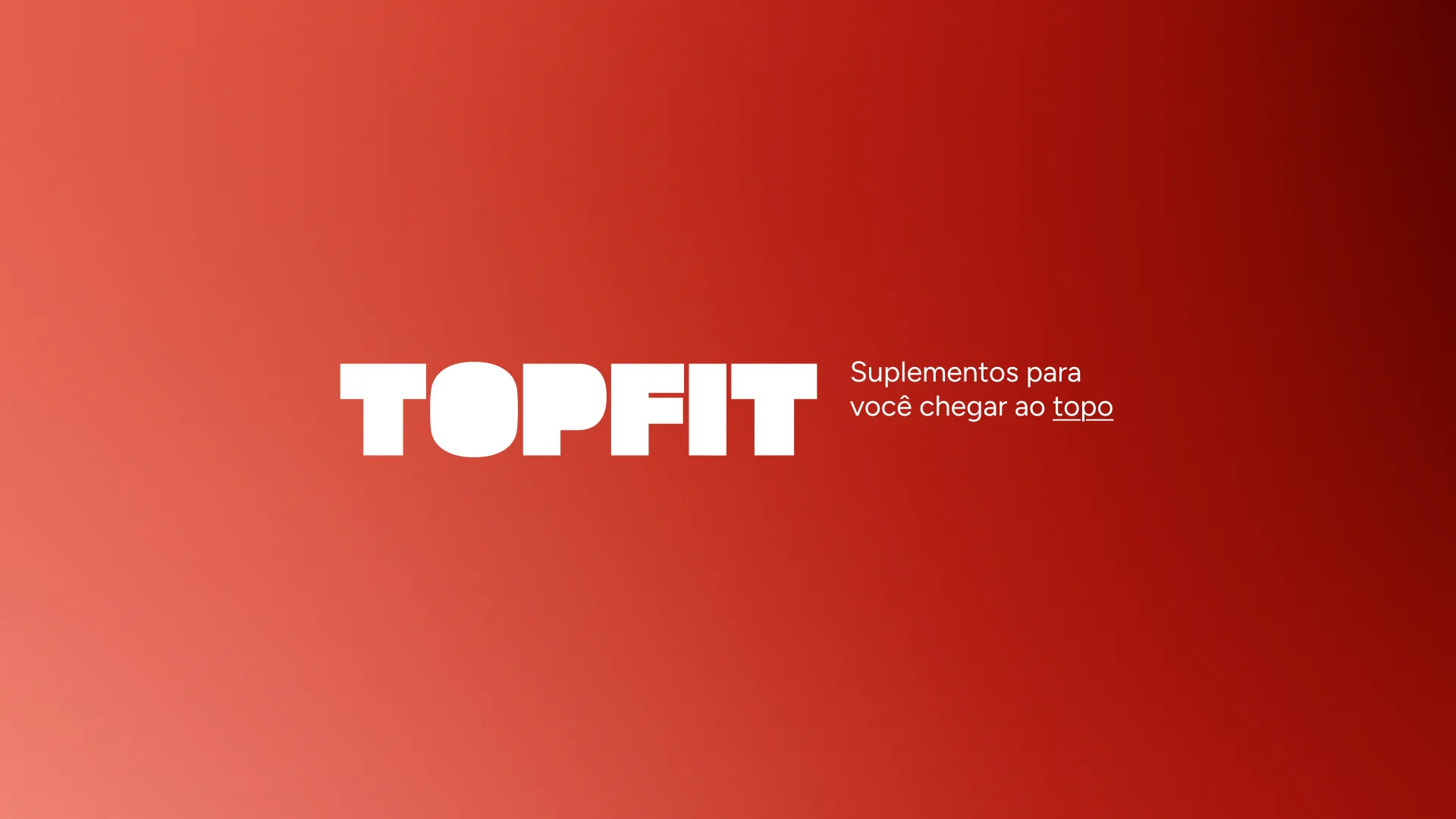
TOPFIT
Supplements to help you reach the top.
Complete visual identity for TOPFIT, a concept supplements brand from Ribeirão Preto (SP) that wants to represent attitude, beyond selling products. Raw, blocky letters, an intense red and an arrow-shaped icon that goes up hold the brand together, from the e-commerce to the packaging.
TOPFIT was not born to be just another supplements store. It runs a physical store, its own e-commerce, marketplaces and distribution, and it sells more than product: it sells attitude, curation and positioning. A brand with its own voice: provocative, raw, direct and authentic.
To deliver the best supplements on the market with curation, personality and impact, and to help customers reach the top, whether physical, mental, aesthetic or in life, no beating around the bush. The vision is to be the most remembered brand among supplement stores in Brazil: not for variety, but for attitude. For delivery. For identity.

Provocative, raw, direct and authentic. TOPFIT pokes, challenges and does not soften what it thinks: provocation is the call to action. It is dense and solid, visually and verbally, and the impact is in the foundation. Focus on what is needed: it says what matters, period. It has a face, a tone and a presence, a visual and verbal statement.
The work went through the brand’s strategic build: logo, typography, color palette, concept, icon, variations and tone of voice, always direct, high contrast and built on the rebel archetype. From there, the identity moved on to the e-commerce, the packaging and the digital content, prints and physical media.


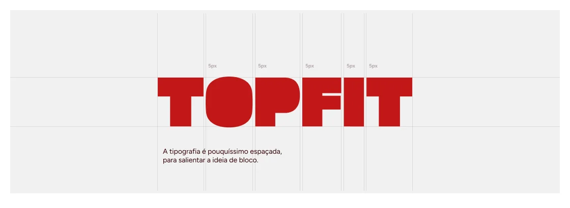
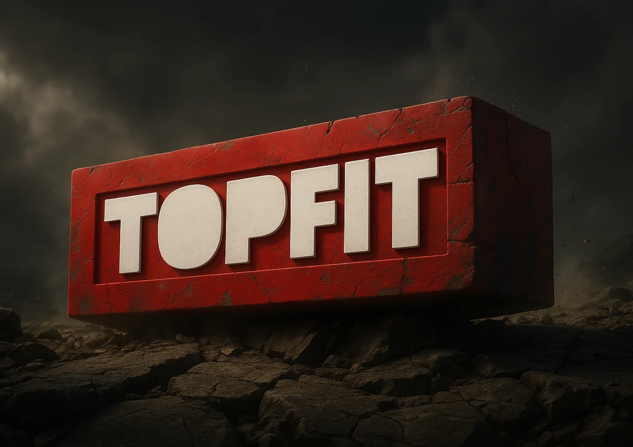
The logo is a visual statement: the name in its purest form, in raw, blocky, heavy letters. We removed even the counters of the “O” and the “P” to intensify the sense of a block, and the type has almost no letter spacing. With those decisions, the only color that fit was red, for its visceral and brave nature.
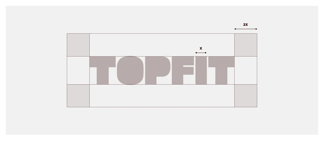
The brand was made to be seen, with impact, clarity and respect for its space. The exclusion zone defines the minimum breathing room around the logo, ensuring legibility and presence even in busy visual environments. The base measure is the width of the letter “I” (X), and the free space around the brand must be at least 2X.
Symbols that shout, not whisper.

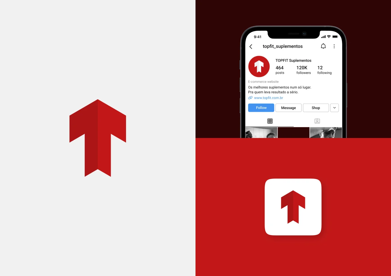
Built from the brand’s “T”, symmetrically distorted, split into two blocks and tilted by 30 degrees, it creates an isometric view that recalls a solid corner. It can be read as a disguised arrow pointing up, the corner of an e-commerce box, or a geometric seal that marks territory.
Intense red (#C21819) is the main tone: strength, movement and power. White and light gray give room to breathe and legibility, especially on digital, while wine and black come in sparingly, as colors of quiet strength.
- Intense red#C21819
- Dark red#A6111F
- Medium red#DA564A
- Light beige#F8B7A1
- Pure white#FFFFFF
- Light gray#F1F1F1
- Wine#2E0506
- Pure black#000000
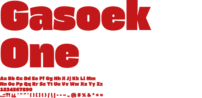
Gasoek One, ultra-bold with straight terminals, imposes on headlines, taglines and statements. When the content needs to breathe, Figtree comes in, versatile and legible, for descriptions and running text.
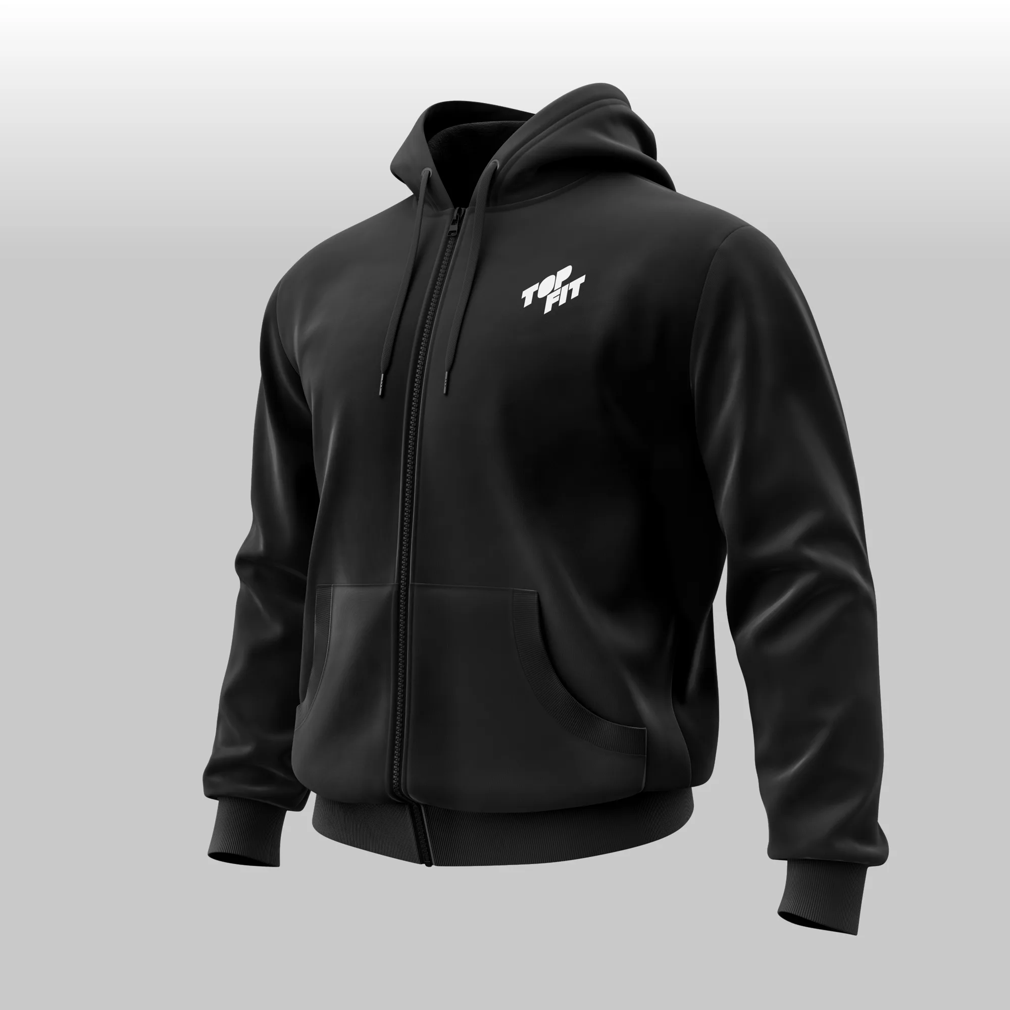
As variações da marca mudam de contexto sem perder a força: do feed a um vídeo, do carimbo a uma estampa. A box logo estampa a TOPFIT como bandeira, a versão isométrica dá movimento e o ícone assina o que for preciso.
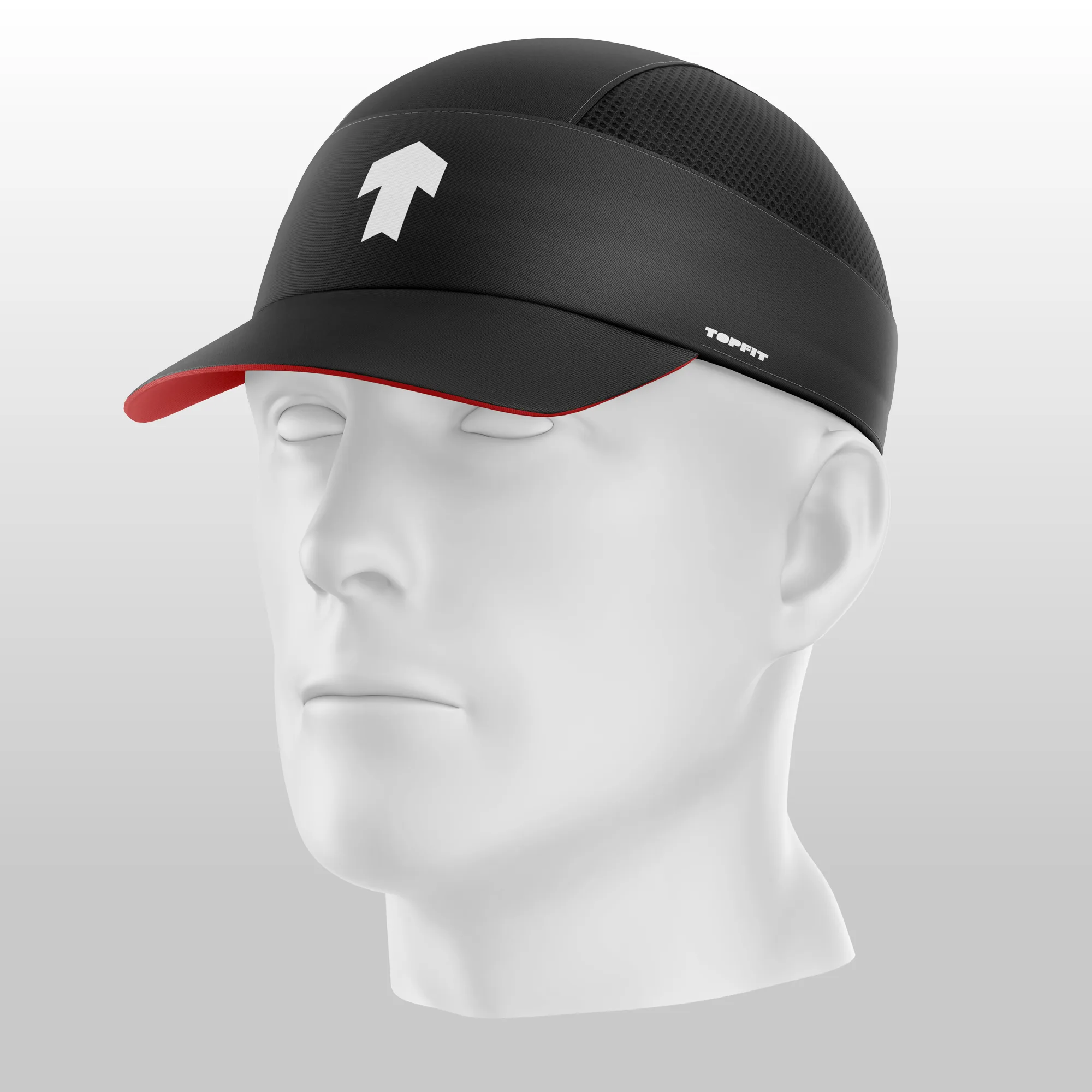
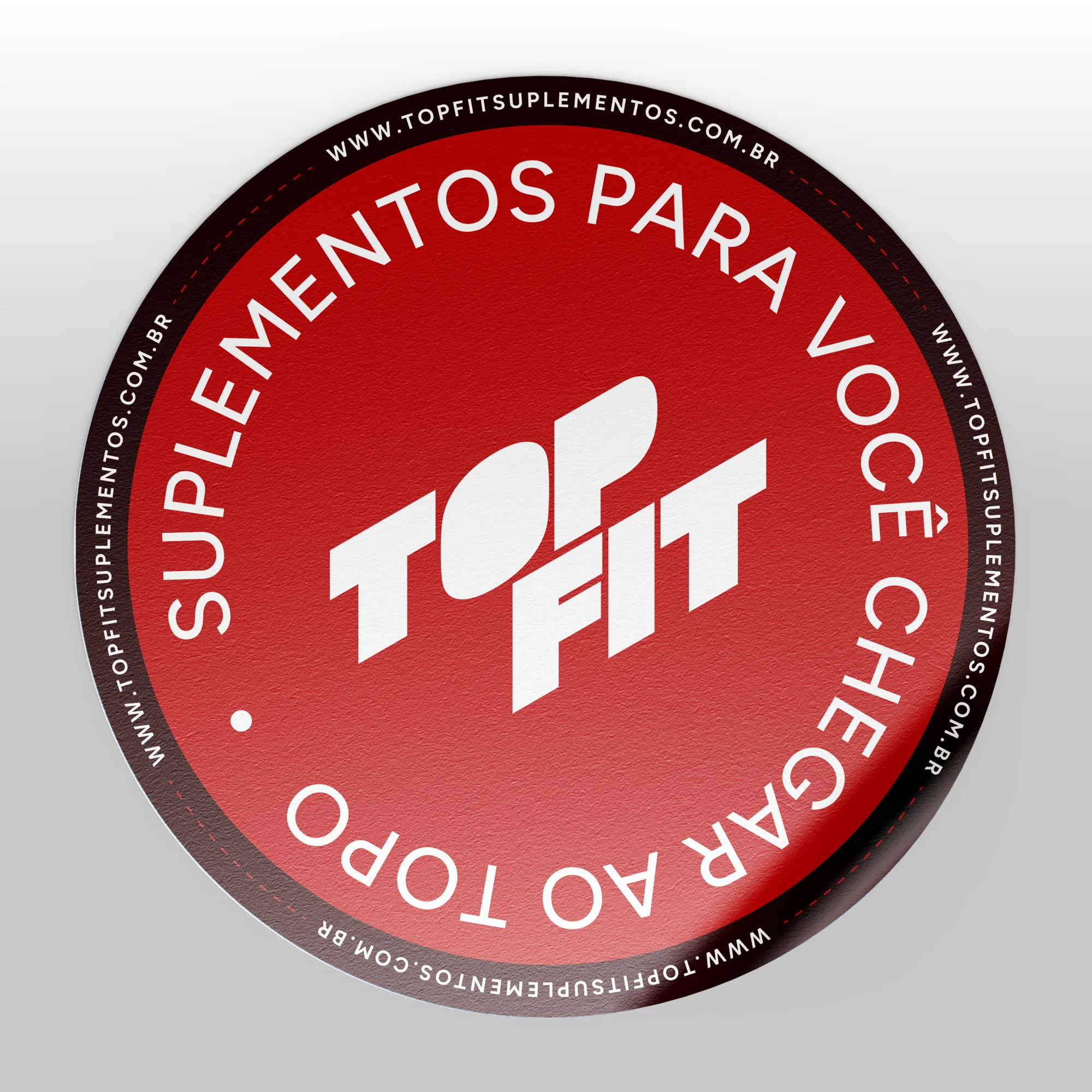
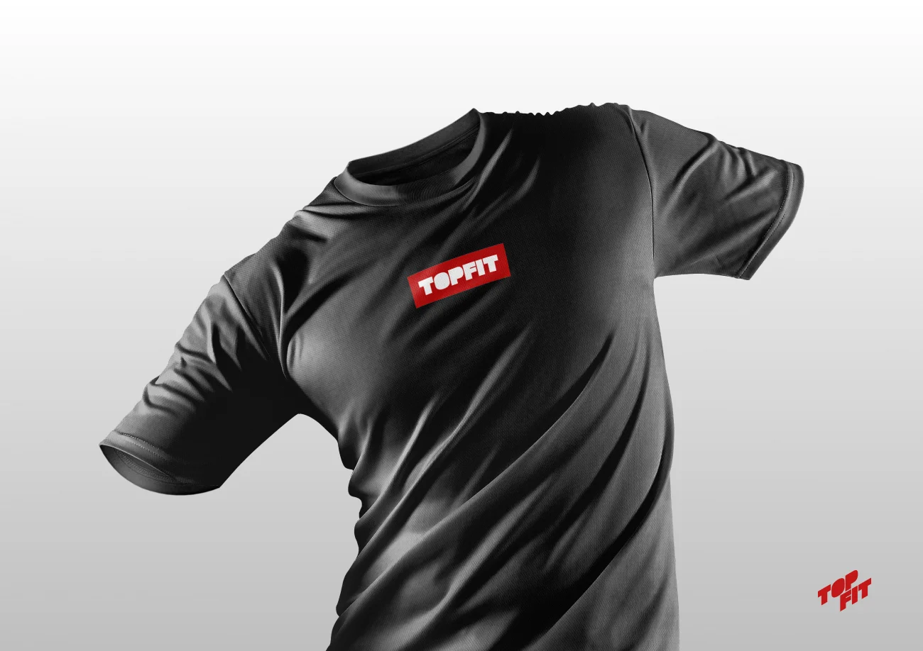

The brand also becomes a pattern: the rising arrow, the name repeated as a print, the circular seal with the slogan and the icon outline over a mountain, a reminder that the top is the destination.
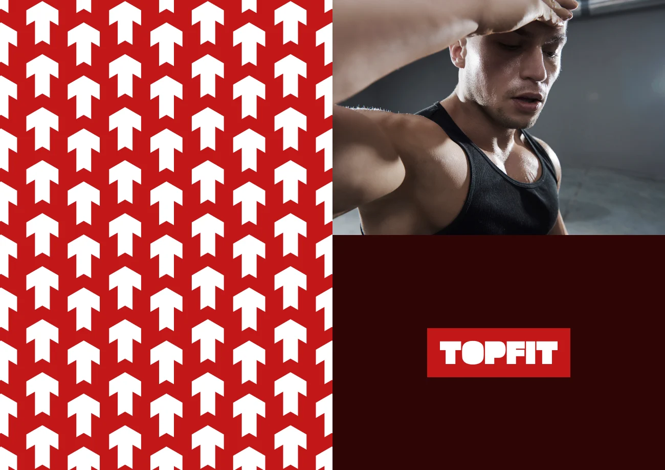
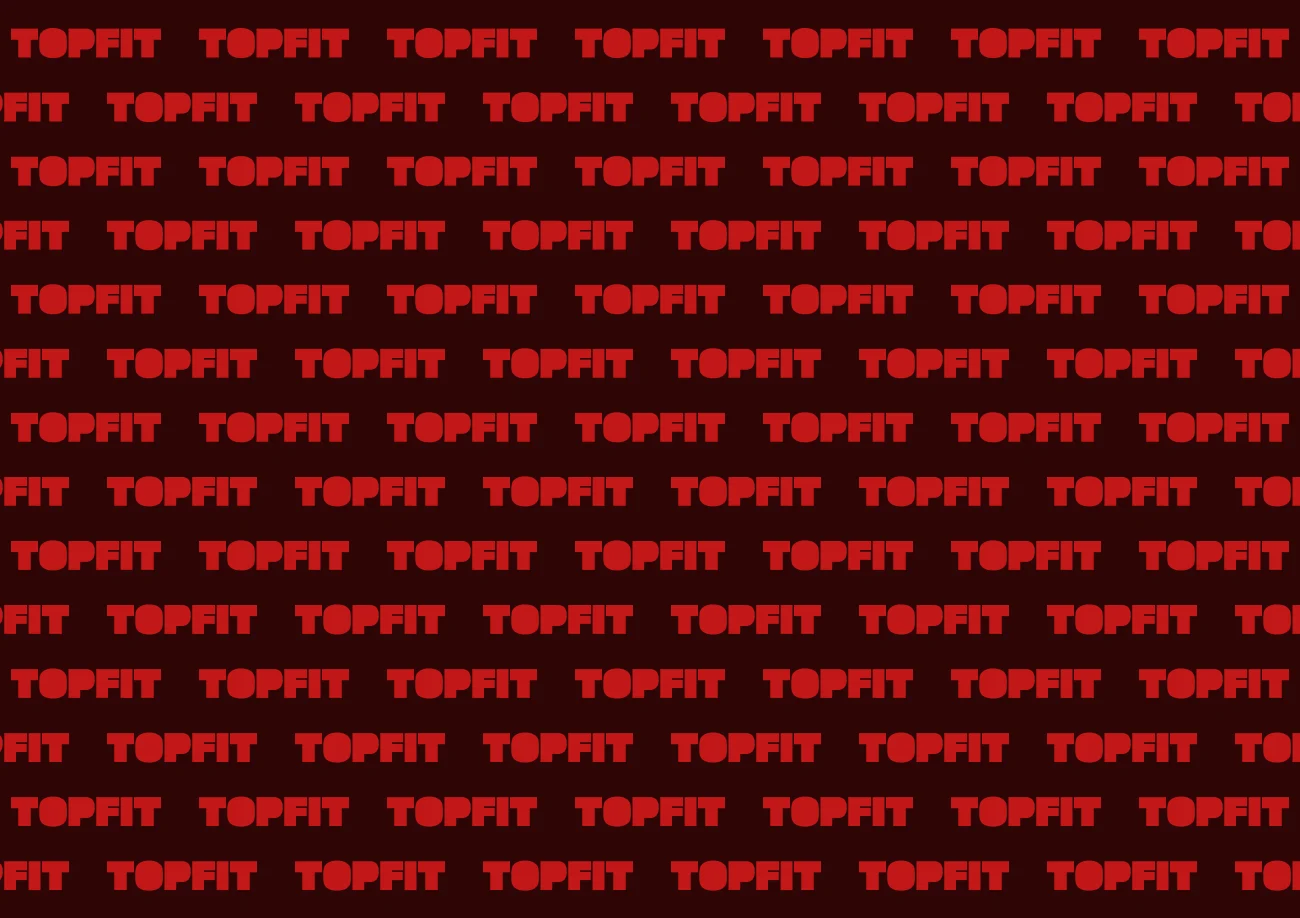
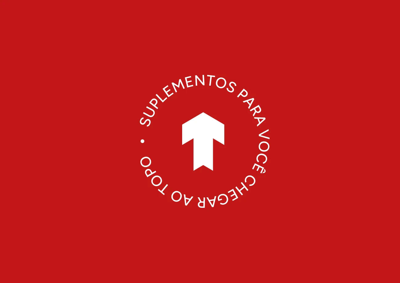
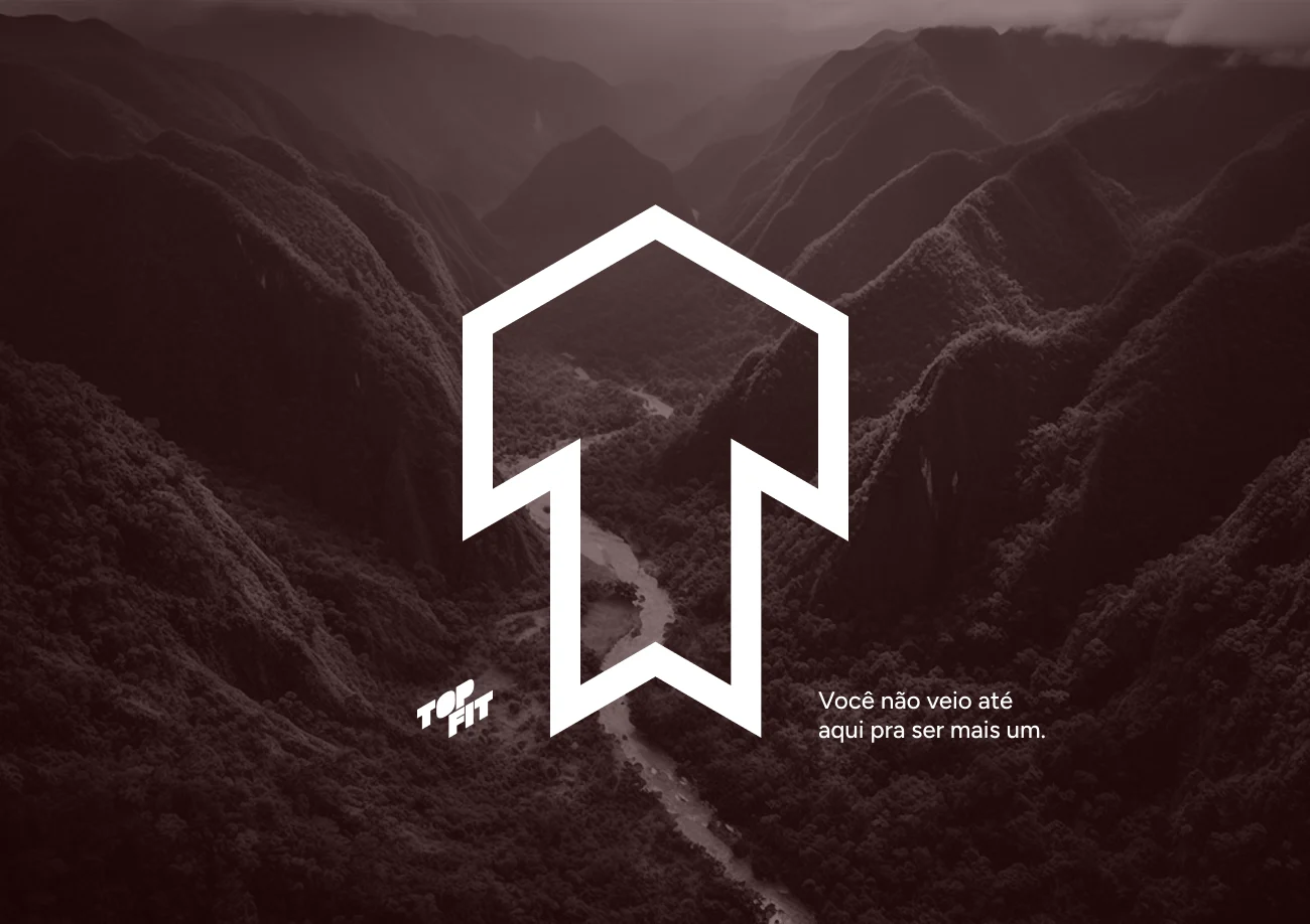
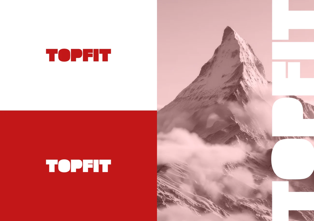
We sell supplements. But also attitude.
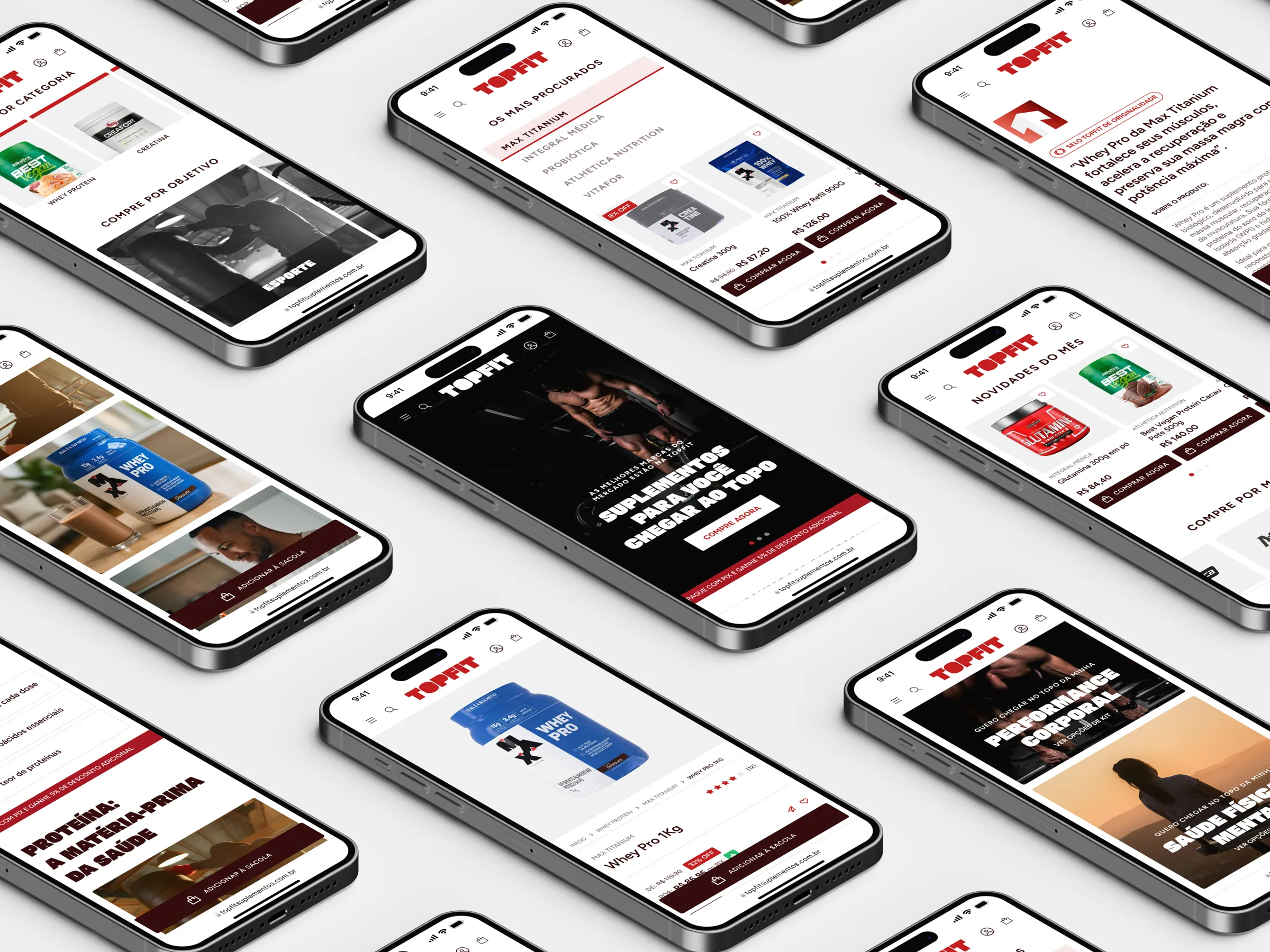
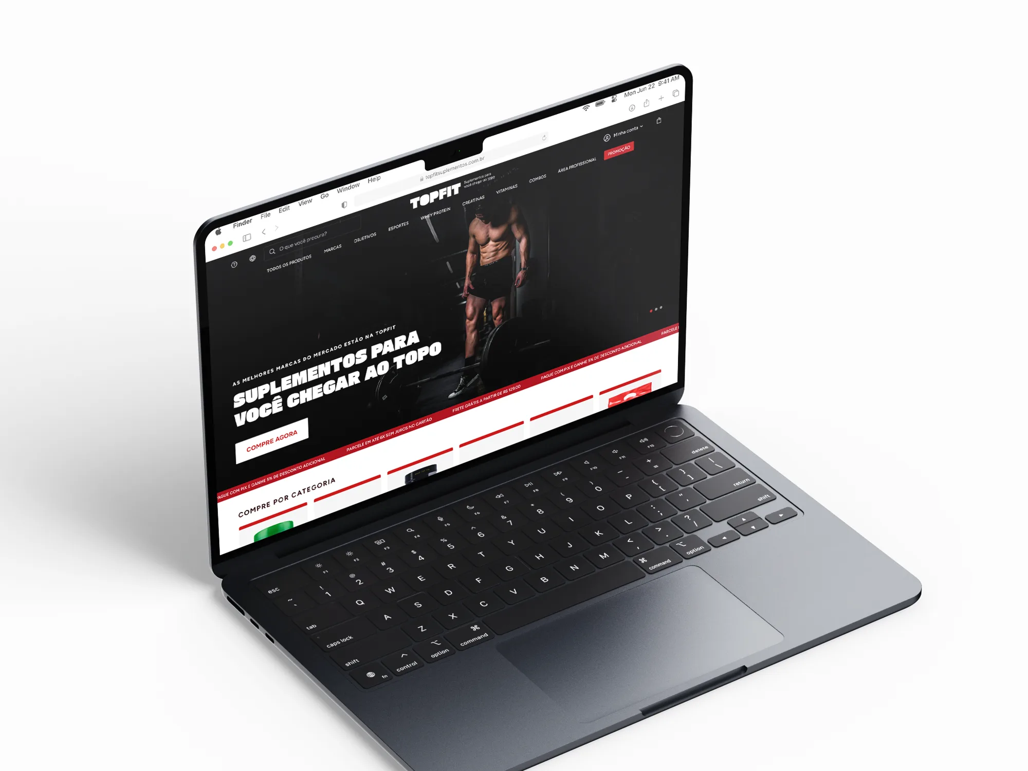
On the brand’s own e-commerce, built on Shopify, the experience is fast, safe and no-nonsense, from the click to the result. The look is high contrast: black background, heavy type and red as the point of action.
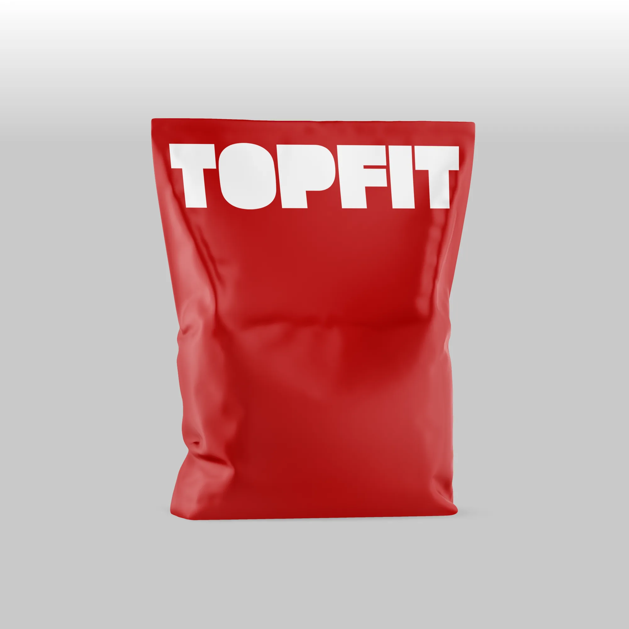
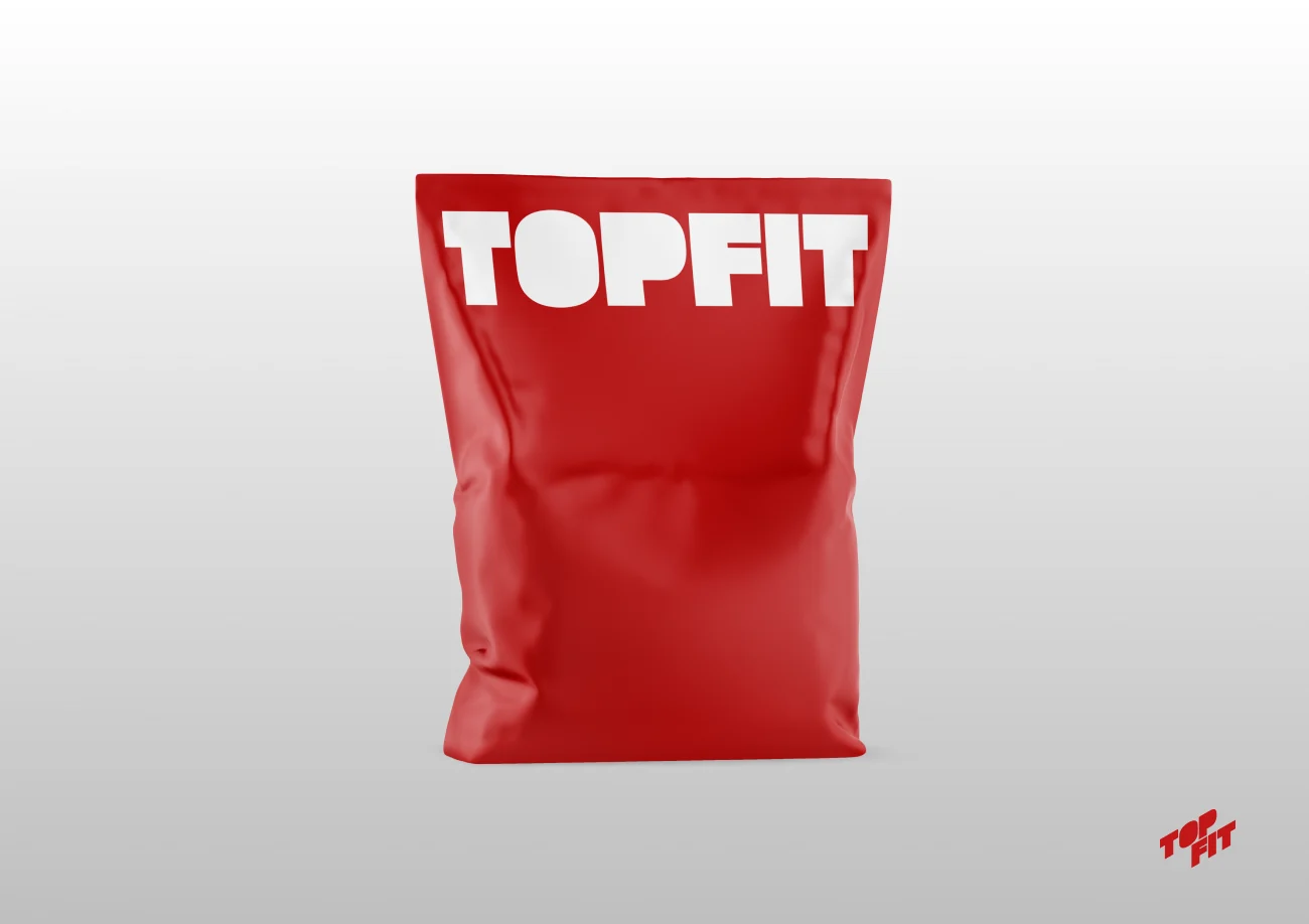
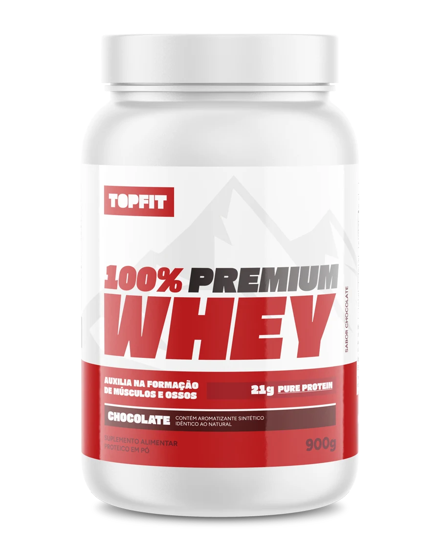
I designed all the packaging for the brand’s own products. The brand becomes the label: raw typography, geometric icons and red as the protagonist, in contrast with the minimalism of white, so TOPFIT stands out on any shelf.
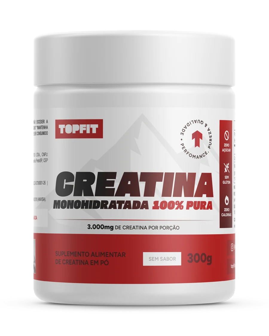
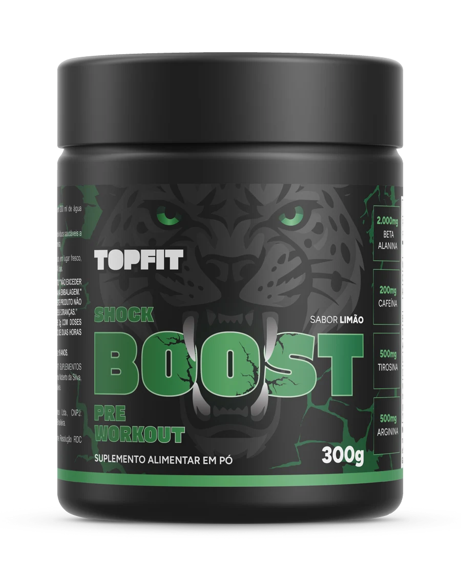
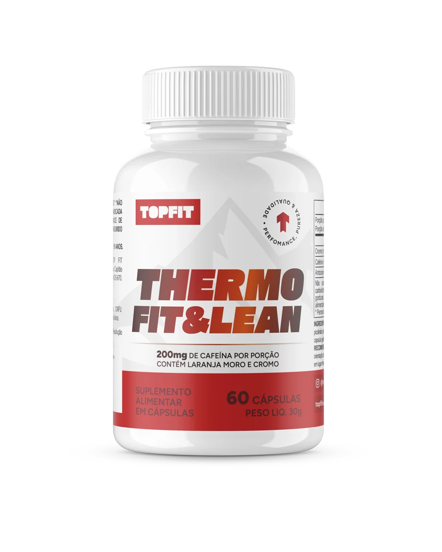
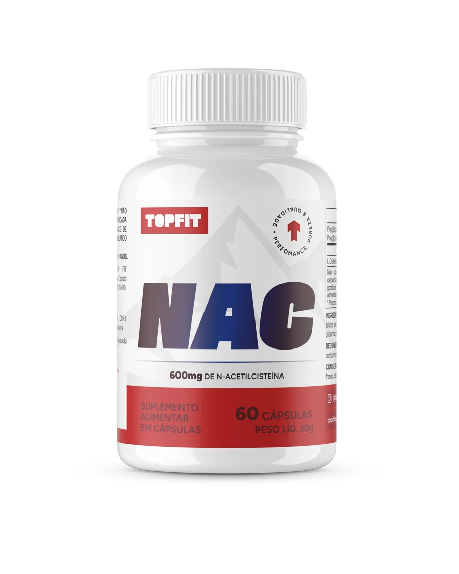
To reach the top.
- Design
- Nícolas de Queiróz
- Agency
- SD Digital
- Briefing
- Luiz Arlindo